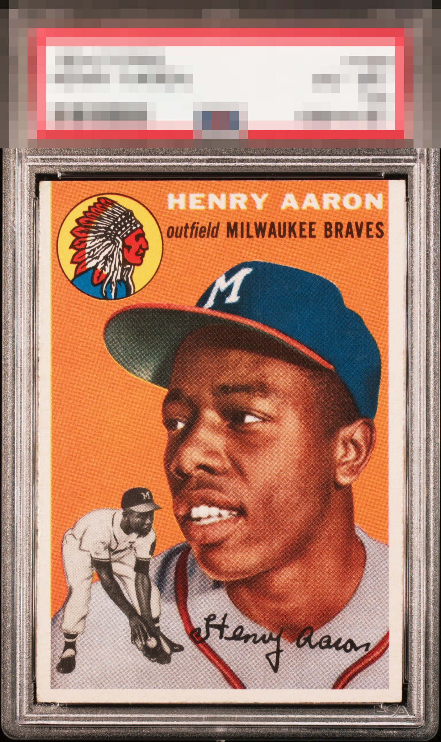
1954 Topps Henry Aaron #128

Reviews & Discussions
11 total reviews

Awesome. Love young Hank. Color is money. Ever so slight tilt. Still A+ from here.

Better centering at the top of the borders and this leaps straight to God Tier.

The image is very clear and really stands out, as does the bright orange background. Very clean card. Better left to right centering and this would be god tier.

Outstanding image quality, color, edges… a touch off on the centering.

I am tempted to say God Tier here because when my eye focuses on Hank's image and the three white borders at bottom, they are all the same size. That slight tilt is only visible at the top. This card is gorgeous.

Great example here. My eye notices a very subtle tile but that's all I've got.

wow the borders really POP. on this card and this series it is so hard to find. Nice and big and clean. LOVE IT The colors and image on the card are solid minor speckling but it blends in Really enjoy this card

Clean surfaces and great color. Centering looks very nice but has a bit of tilt.

One of the best centered Aaron RC's I've laid eyes upon. The image is unblemished. Mild, honest corner wear and side border thickness disparity at the top of the card are the only flaws-- and they don't impact eye appeal much to me.
EyeQ+
EYEQ+ TROPHY CASE


Rating Distribution
11 total reviews
Yes please. Top notch color & registration with excellent framing. Sweet rough cut on the left. A tiny bit of tilt is noticeable but the other traits more than make up for it. Love this one.