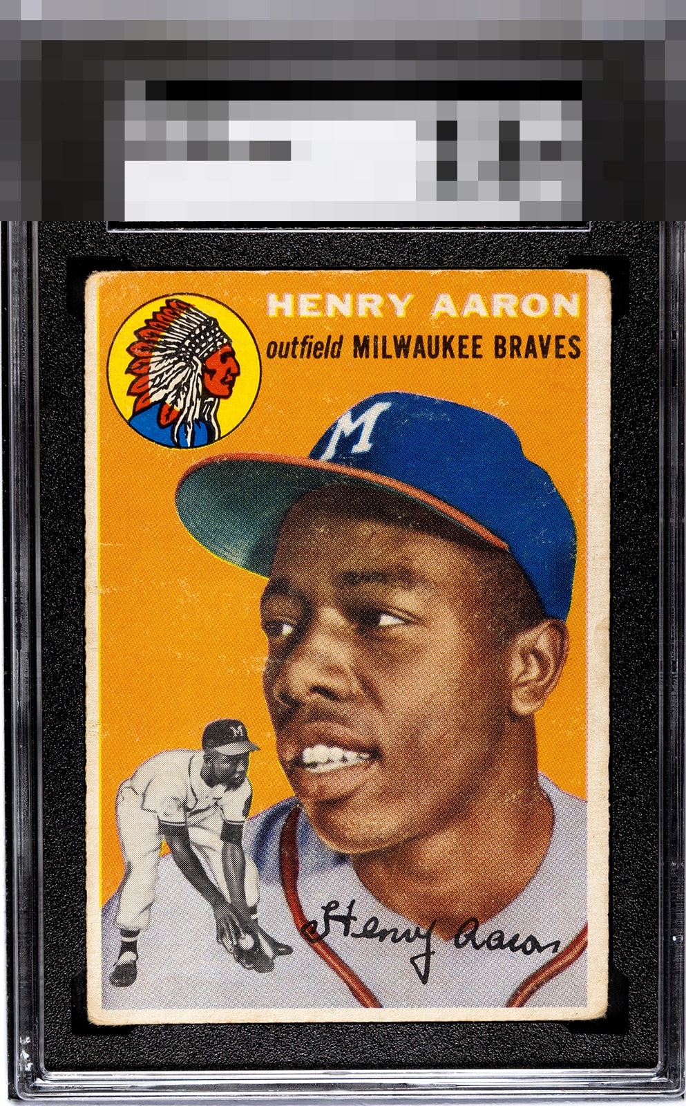
1954 Topps Henry Aaron #128

Reviews & Discussions
11 total reviews

Love this card in the sgc tux. Edge and corner wear reduce some of the eye appeal of this historic card

Centering and surface wear / snow stand out - but it’s still a very attractive version of a truly iconic card of one of our game’s inner-circle all time greats. Congrats on this Hank


With your soft corners and edges and OC, it’s hard to look past it all. The surface has some snow as well.


Obvious rounding, centering shift & some surface issue but still manages to be a presentable Hank RC

The absence of any one loud flaw keeps the eye appeal in the B Tier for me. The wear is there but does not scream out for attention and lets you enjoy the image to a decent degree.

the framing on this card thru the borders is the key. This has better borders than most of these but these are both mis-sized, off centered and discolored which holds the card back. The card has nice colors and a strong image but the snow is there and though it does not distract to much it holds back the eye appeal

A bit too much corner and surface wear for my liking. Solid looking card.
EyeQ+
EYEQ+ TROPHY CASE


Rating Distribution
11 total reviews
Despite the presence of corner rounding and surface abrasions, my scan of this Aaron detects visual appeal. If only humans could wear their flaws with such grace!