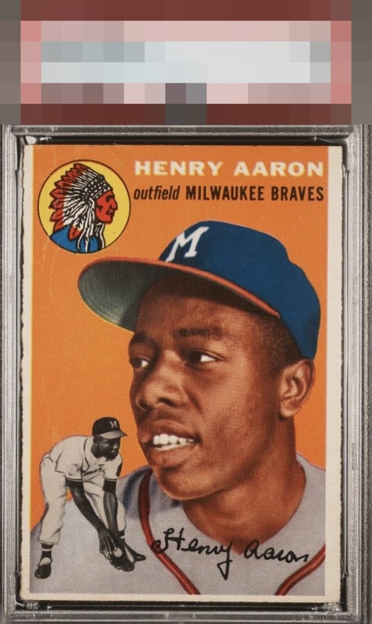
1954 Topps Henry Aaron #128

Reviews & Discussions
11 total reviews

Nice color and I dig the rough cut. The centering and tilt hold it back for me though. Maybe would have been a B- without the creasing near the logo. Either way it's above average.


The image looks great. The orange background looks good as well, but there are some surface issues on the left. The centering is the main issue, but looks nice overall.

Man, if the centering was great this would get into the top badges. The other flaws are not a problem for me at all but the centering puts it in the B zone.

Centering is really the flaw that affects eye appeal here, since those wrinkles don't bother me at all. Were the centering better this could even hit the A- badge! A really nice card.

Great sharp image with beautiful bold color. This copy is just held back by centering for me.

Paging Lord Slabington! The EyeQ+ on this card will be impressive. Centering is the lone issue for me here as the wear I detect requires too much effort to see, and so it does not leap out and dampen the eye appeal.

This is a lucky card. Surface issues especially near the Indian but it blends in real well. The border sizes do not match but are better than most of these cards and they are brighter than most Add the strong colors and great image and Pow this is infact a WOW card to me

Colors are really nice on this example. Centering and surface creases are the main issues.
EyeQ+
EYEQ+ TROPHY CASE

Rating Distribution
11 total reviews
Special card as those creases really do not bother me nearly as much as if there were on either of the Hank images. The centering is the main flaw that affects eye appeal here, but because the images of Hank are so clean it retains Tier II Eye Appeal for me.