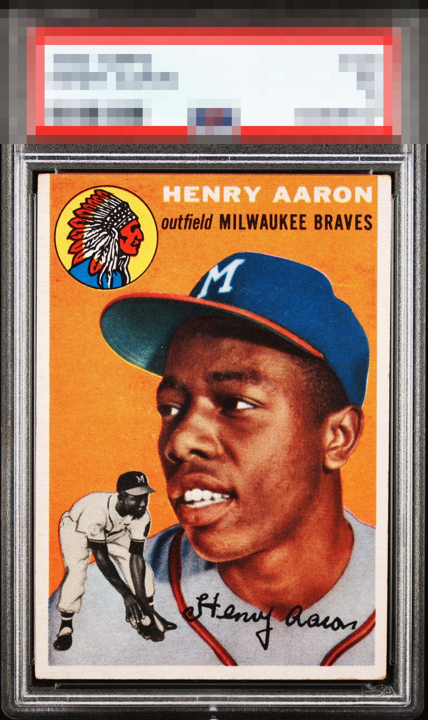
1954 Topps Henry Aaron #128
Reviews & Discussions
12 total reviews

Outstanding colour and lovely centering, only thing holding me back from GT is a print defect next to his hat.

Great centering and the color really pops. The main image also looks great and well-focused. Minor corner wear, especially the lower right corner, keep this just below god tier for me, but an example I'd be proud to own.


The centering is perfect with no tilt. The color is bright and beautiful. This is an incredible find.

WOW PSA got this wrong to me. Those borders are nice sized, and nicely centered, and so clean and bright. Rarely ever see borders like this. The image and colors are strong and the BLue of the Hat really POPs. Yes some minor surface wear but this is a great card

Some print in the orange is the eye appeal issue for me. The very, very minor border sway is hardly noticeable and does not factor in to me.


This centering is phenomenal. The overall look more than compensates for the small amount of stray print.

Nice bold colors. Some surface inconsistencies in the orange background. Very well-centered.
EyeQ+
EYEQ+ TROPHY CASE

Rating Distribution
12 total reviews
Centering and colors are extremely strong on this blazer. Slight print marks on the upper part of the card and upper corners a touch soft, but overall this card presents extremely well with strong eye appeal. Would look great in any collection.