1954 Topps Henry Aaron #128

Reviews & Discussions
12 total reviews

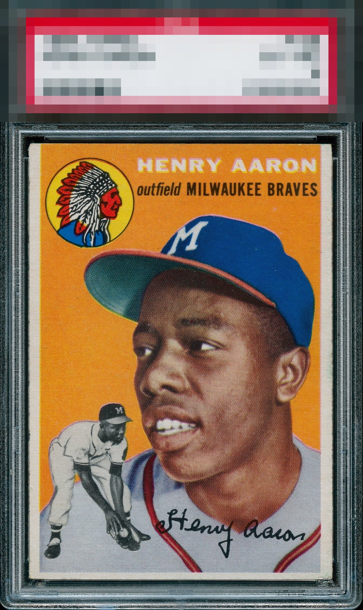
Centering = A- (T to B keeping it from being an A) Edges & corners = A Registration & Surface = A-

What color on this one. Centering is also sharp. Great example of a tough card.

Examples like this is why I frustrate my wife with the amount of time I spend perusing the inter webs "on the hunt." Maybe a click thin on the bottom centering, thus keeping it out of GT status.

The image and color look great. Centering looks off top to bottom and it appears to be out of focus a little, most noticeable by his name up top.

A sliver from the A tier of eye appeal for me. Some side sway and centered low, the blurriness to the name letters is very mild. High eye appeal yet just shy of the top tier.

Clean copy with excellent print registration, rich color that draws the eye, and a welcome absence of the print specks that so often haunt this issue. The type is crisp and confidently inked. A faint touch of edge chatter is the only restraint on an otherwise commanding presentation. A clear A for eye appeal and a fitting tribute to one of the greats.


This is a killer card and one of the Best 1954 Topps Aaron I have seen. Such a strong color and image and nice borders and bright

This card is a stunner! Only thing taking it out of god tier is that it is a little low. Great card.
EyeQ+
EYEQ+ TROPHY CASE


Rating Distribution
12 total reviews
Usually the side borders really lean in one direction or the other; these side borders maintain even thickness their whole length. Centered a touch low is the only flaw that I notice. Superb example of The Hammer's rookie!!!