1955 Topps Harmon Killebrew #124
1 / 2

💬
Reviews & Discussions
5 total reviews

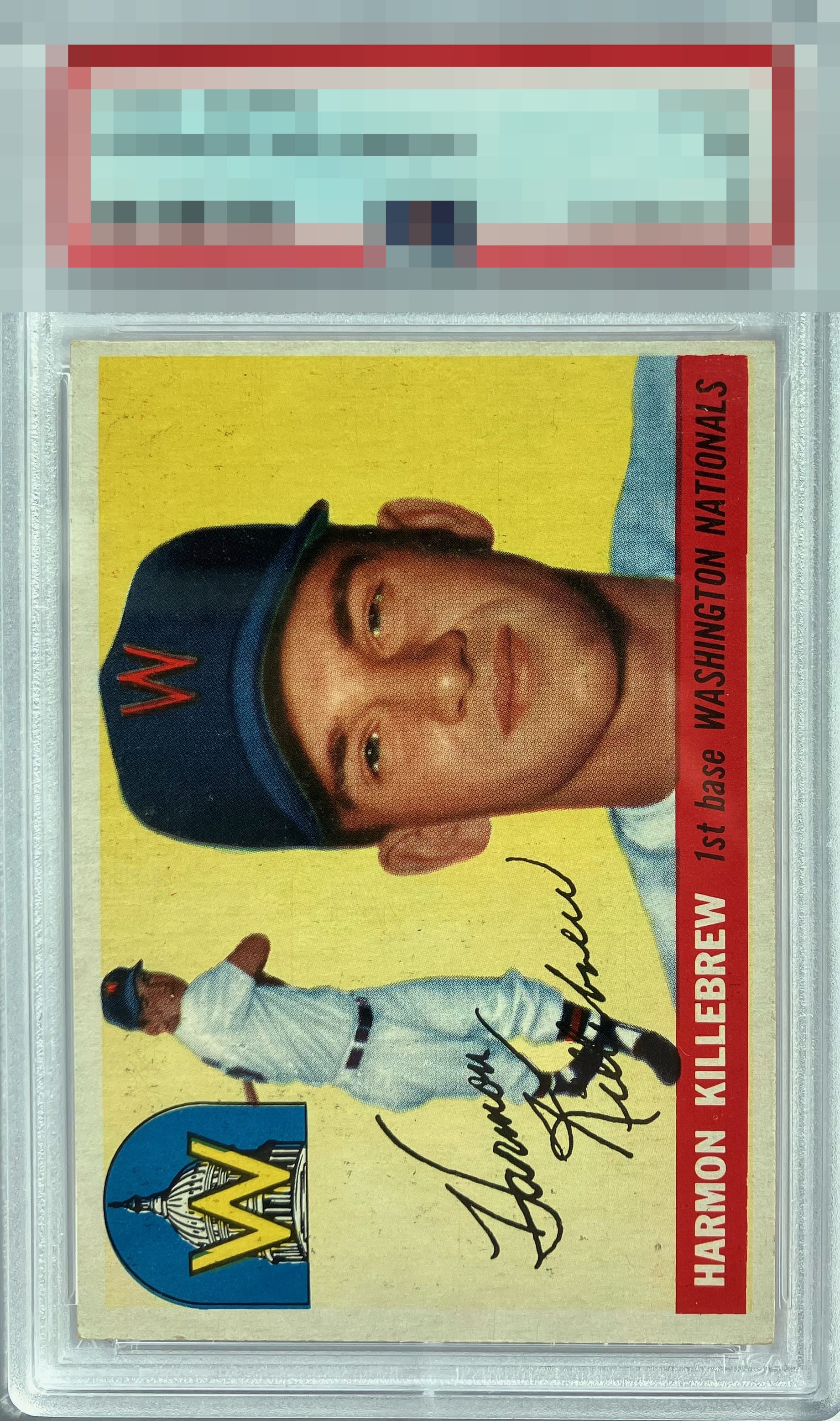
Good colors and image. Centering is shifted to the right and surfaces have a lot of PD and snow.

Solid mid-grade example that would rate higher for me without the black overprint.
3 reviews
2 reviews
EyeQ+
--
Global Population
1
POPULATION ACROSS ALL GRADES AND GRADING COMPANIES
Global Eye Rank
—
No Eye Q+ score
Population in Grade
1
POPULATION IN THIS GRADE ACROSS ALL GRADING COMPANIES
Eye Rank in Grade
—
No Eye Q+ score
EYEQ+ TROPHY CASE

GLOBAL

IN-GRADE
Trophies appear here when earned.
📊
Rating Distribution
5 total reviews
G
0%
A+
0%
A
0%
A-
0%
B+
0%
B
0%
B-
2 ratings
67%
2
C+
1 rating
33%
1
C
0%
C-
0%
D+
0%
D
0%
D-
0%
F
0%
The colors especially the yellow really POP. The image is good but the surface conditions have its impact. The borders are not only off center but the coloring is off to the point you can almost not tell where the image stops and the borders start