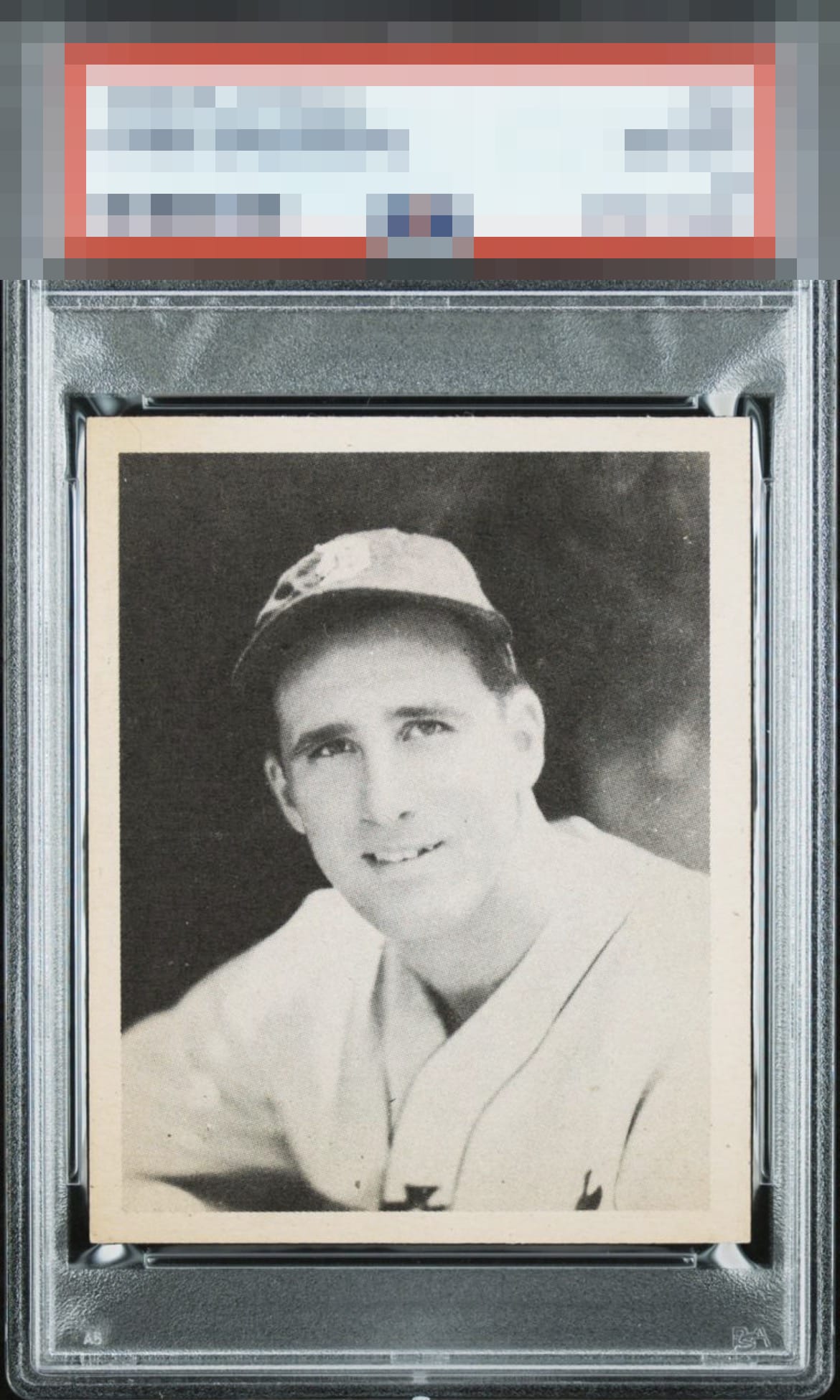
1939 Play Ball Hank Greenberg #56

Reviews & Discussions
11 total reviews


Centering and what looks like toning along the right side are my notes. That said, this is a sharp card w/ great eye appeal.

The centering and toning combine to cap eye appeal for me at the B+ level, and without one of those this would land higher.

The toning on one side bothers my eye a bit. Centering isn’t that big of a deal for me this time since the white borders mostly retain their same width on each specific side. Corners are sharp.

I am normally much harsher on centering but something about this card just works for me. The toning in lower left corner does not faze me. Centering is really it.

The image looks nice and clear. Centering is good but slightly off. That and some border toning on the left are the only issues.

nice card with some nice eye appeal. the discoloring around the card and the centering (L/R) holds it back


EyeQ+
EYEQ+ TROPHY CASE


Rating Distribution
11 total reviews
Really tough card. And they don't come much better. But centering, slight toning and turnt up brightness means they do come just a bit better.