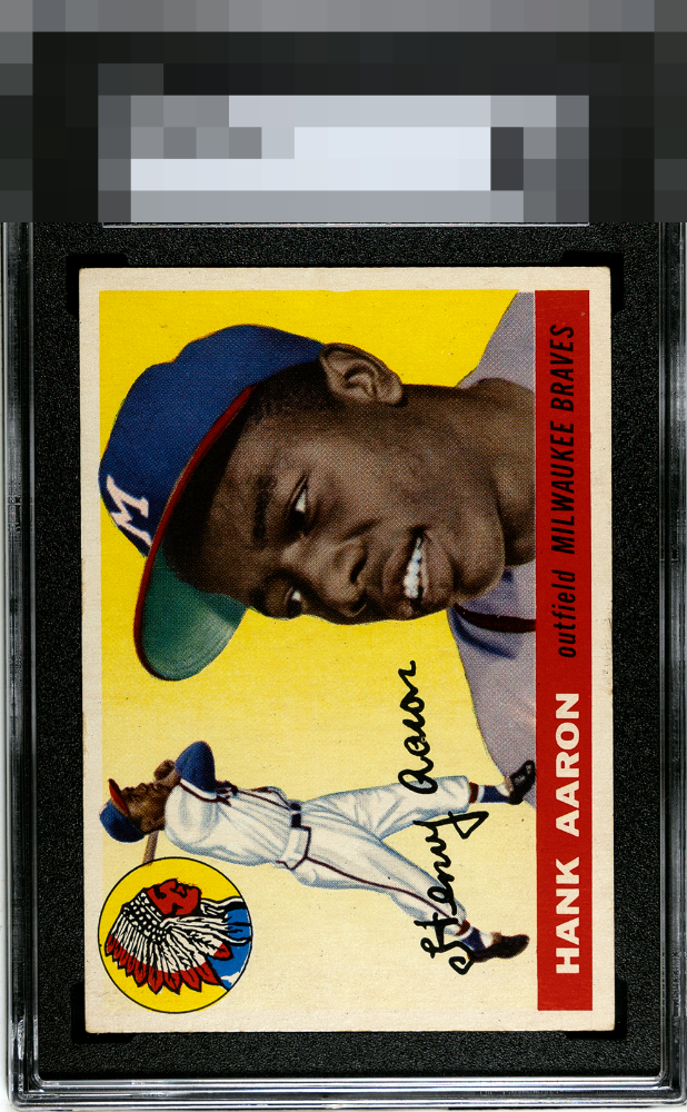
1955 Topps Hank Aaron #47
Reviews & Discussions
10 total reviews

Great looking. Bold color, sharp registration, strong centering, and a clean surface creates immediate visual appeal. The portrait displays with excellent clarity and vibrancy, allowing the iconic design to show at its best. Light toning along portions of the border and surface is visible, though it does little to detract for me from an otherwise highly attractive example.

Edges and corners knock this into 'B' range for me. The centering and color aren't strong enough to keep this in the 'A' tier.

Gotta love the color on this one. Just a slight shift & touched corners

Image and colors are top notch. Some edge wear on the bottom border holds it back a bit. Overall, a well-centered and good looking card.

The centering and yellow are so strong that the bottom edge wear cannot dislodge the eye appeal from A Tier for my taste.

very nice looking card with really strong main image and colors and the Blue of the cap really POPs off the page. minor surface issues that blend in well together Card would be a keeper for me
EyeQ+
EYEQ+ TROPHY CASE


Rating Distribution
10 total reviews
Soft corners but great centering and color. Some minor surface wear, but still pops.