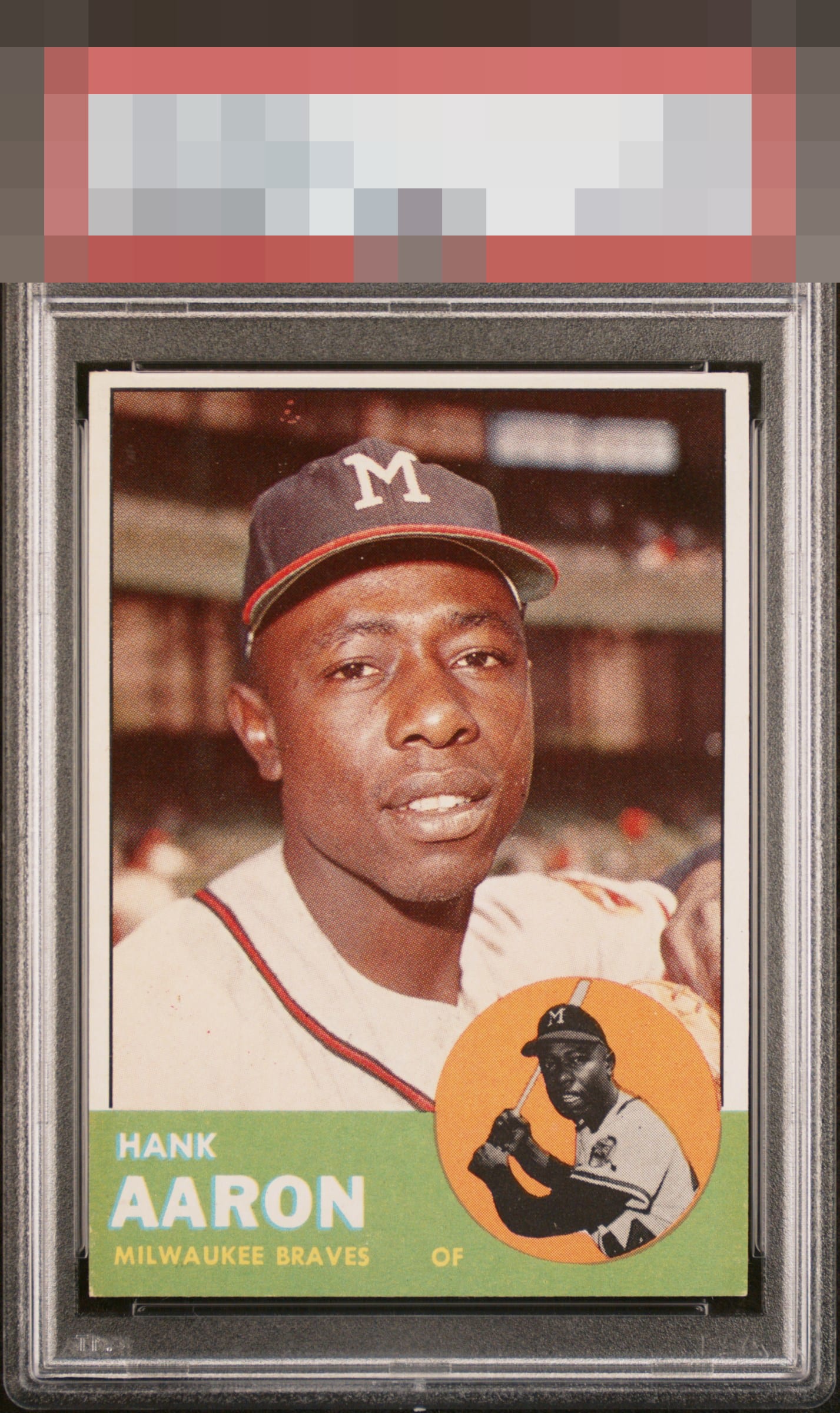
1963 Topps Hank Aaron #390
Reviews & Discussions
8 total reviews

Really well centered L/R. Bit bottom heavy and I see some red spots above his cap, but overall the card appears sharp to me.

Image looks nice and clear. Centering is a little off, there is some corner wear on the bottom corners, and a few print defects up top.

Some surface issues above his head and some honest corner wear.

like the look of the card and the framing is good enough. the colors do not Pop but present well. there is both minor surface wear and minor damage to the corners at the bottom. A nice card to have and enjoy

Good eye appeal with centering and some surface blemishes above his head that bump my eye a bit. Lower corners are a distant second concern. The absence of PD in the green and the circle background are a plus and something I always look for.

Very good image. Some PD in the background and a bit centered towards the top.
EyeQ+

EYEQ+ TROPHY CASE


Rating Distribution
8 total reviews
Side to side is excellent with a thin top border. Modest corner touches but a beautiful image of the Hammer. Very nice eye appeal.