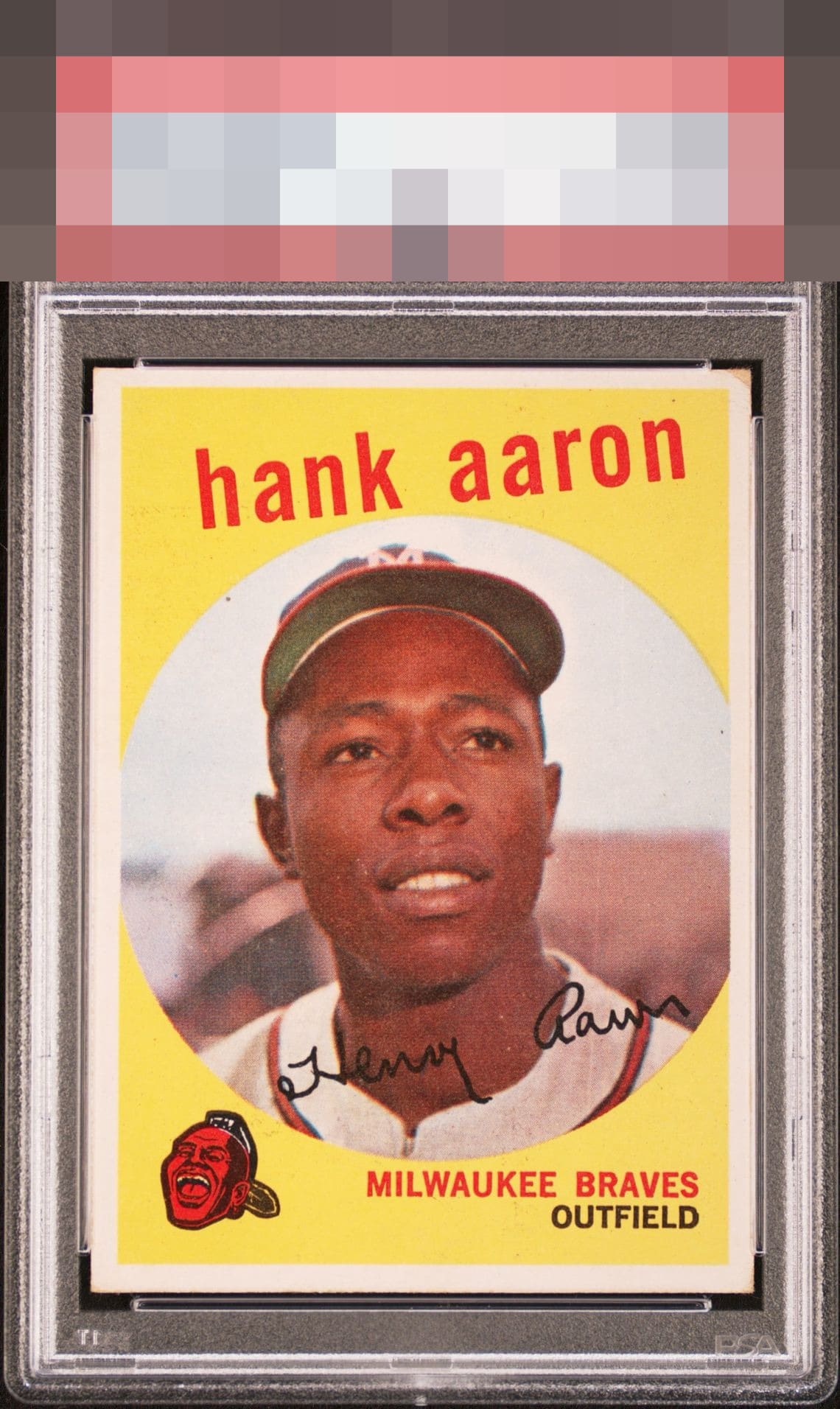
1959 Topps Hank Aaron #380
1 / 2
Click to enlarge
💬
Reviews & Discussions
8 total reviews

Centering shifts and a brown corner take this down a bit for me


Slight centering shifts and one corner with a significant touch surround a well printed image. Nice eye appeal remains intact.

Great example of flaws that don't hurt the core aesthetics of the card; centering and top right make impact, but Hank can still easily be enjoyed.

colors seem a bit muted than others but it presents well and i would be proud to own it

Locked
1 review
EyeQ+
121.0
Global Population
12
POPULATION ACROSS ALL GRADES AND GRADING COMPANIES
Global Eye Rank
#6
Population in Grade
1
POPULATION IN THIS GRADE ACROSS ALL GRADING COMPANIES
Eye Rank in Grade
#1
EYEQ+ TROPHY CASE

6th Place
GLOBAL

1st Place
IN-GRADE
📊
Rating Distribution
8 total reviews
G
0%
A+
0%
A
0%
A-
0%
B+
2 ratings
29%
2
B
4 ratings
57%
4
B-
1 rating
14%
1
C+
0%
C
0%
C-
0%
D+
0%
D
0%
D-
0%
F
0%
EyeBot notes centering and corner wear, yet also an image and surface that allow for enjoyment from human and cycloptic artificial eyes alike.