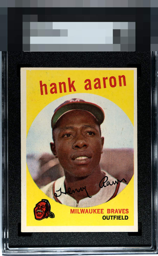
1959 Topps Hank Aaron #380

Reviews & Discussions
10 total reviews

Pushed up and to the right with some excess print but the bright yellow in nice


The image looks nice and the color is bright, although the bottom half seems brighter than the top. Centering is the main issue and there are quite a few print defects.

Nice color throughout, but centering and what look like a few print dots hold this copy back.

Centering issues are a bit sever for me and caps the eye appeal at a B-. Other attributes like vibrant colors, solid corner and a clean image are solid.

Hank is clean and focused and the PD while there around his name is not really a detail that jumps out at me; centering is the main issue to me.


I enjoy the card and the colors and the image and the borders are clean and bright. The hold back is the borders off centered, mis-sized, and the slant of the factory production.


EyeQ+
EYEQ+ TROPHY CASE


Rating Distribution
10 total reviews
Bright borders and the whole nine yards. Bit of schmutz in the image and obvious centering issues make it hard to push up in the ranks.