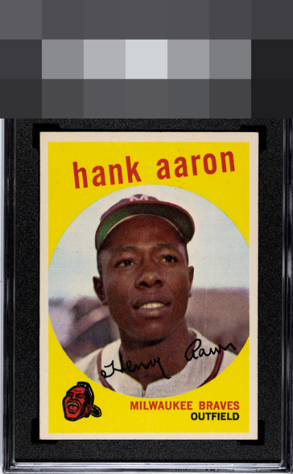
1959 Topps Hank Aaron #380

Reviews & Discussions
11 total reviews


T/B centering, a vertical print like and a small print defect below the second a in Aaron. The card is nonetheless cold lemonade on a hot day.

Nothing that ruins the party for me. A little top bottom but not enough to draw the eye

Nice image and the yellow background looks good too. Centering is better than most but a little off top to bottom. The main issue for me is the vertical print line

At first glance, the eye appeal looks strong. On closer inspection, the centering could be a bit better, and there appears to be a print line running down the left side of the card.

Very curious to see the grade on this card, looks great to my eye. Bright, sharp, nothing that jumps out and bothers me at all.

Colors POP and I like the borders but the centering is not the best and the borders could be brighter. But the colors really POP and the image is really sharp

I love yellow cards. Only centering lowers the eye appeal yet it remains in the A tier for me.
EyeQ+
EYEQ+ TROPHY CASE


Rating Distribution
11 total reviews
To my lone cycloptic eye, this Aaron remains a top tier example, as the eye appeal absorbs the centering and surface flaws with surprising grace.