1962 Topps Hank Aaron #320

Reviews & Discussions
11 total reviews

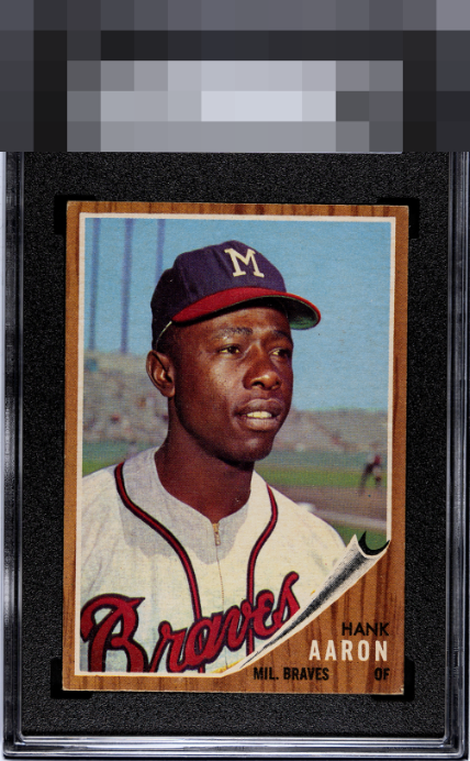
Well centered, and the edges look better than most 62s. Minor corner wear is the only issue.

Not my first time saying that I am (controversially) a huge fan of the 62 set. A beautiful Hank from that set here - the print, image clarity, and color pop/saturation are the stars of the show. The noticeable title and corners hold it back just a touch.

Nice image of Aaron - colors pop, face is well defined, and the background is clean. Holding the card back to me are slight centering tilt and lower right corner.


This is a beauty to me. On 62Ts, I’ve found it’s always a tradeoff between perfect centering and edge damage, and this one strikes a near-perfect balance. The registration also looks top notch to me.

THe Borders held up better than i would have thought. THe Danger of the Wood grain style border is when it nicks or chips as you see on the bottom edges and corners it then shows as white and the contrast makes it really stand out (to a person like me who is big into borders). But most of the border is nice and strong. THe colors and the image are solid and this is a card I would proudly own and display

Wow the wear is mild for a 1962. Harsh day at SGC when it went it yet will give it some love here. It certainly is easy on the eyes.

What I see looking at this card is that woodkit with smooth edges and no white on the corners. A tick better centering and it would be God Tier eye appeal to me.

This is special. Hits the eye fantastically let alone for a '62T card!
EyeQ+
EYEQ+ TROPHY CASE


Rating Distribution
11 total reviews
My cycloptic eye is pleased with this Hammer. Centering, edges, and primary image posses high-end beauty. Corner wear is logged without vendetta.