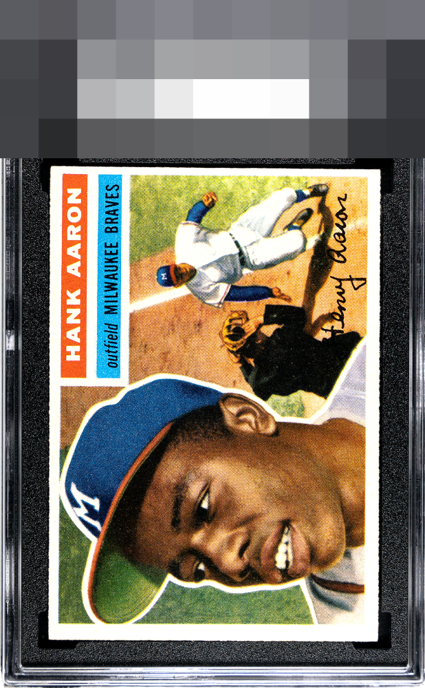
1956 Topps Hank Aaron #31

Reviews & Discussions
10 total reviews

Oh how the colors leap off this card! Bold. Images are clear due to great registration (Mays has never been clearer). Love the clear outline of Aaron, and how the white is consistently bright throughout the card. Only a centering shift right knocks the grade down. The shine on this card would put shade on any cards you place next to it.


Flirts with the top tier. So much of this is A or even A+ yet the centering keeps it at a B+ to me.


Centering is the only flaw that factors in for me here, great looking card otherwise and strong eye appeal overall.

Centering is the only issue here as the card is so strong otherwise.

WOW the card POPs and just missed greatness by the borders not even sized and the centering issues both top/bottom and L/R But wow on the colors and wow on the image and the details of the card. Card meant to be enjoyed but also what could have been


EyeQ+
EYEQ+ TROPHY CASE


Rating Distribution
10 total reviews
A beautiful 56 Hammerin Hank. The print is bold and beautiful with a ton of pop - but centering and diamond cut limit it to a very strong high B tier for my eye.