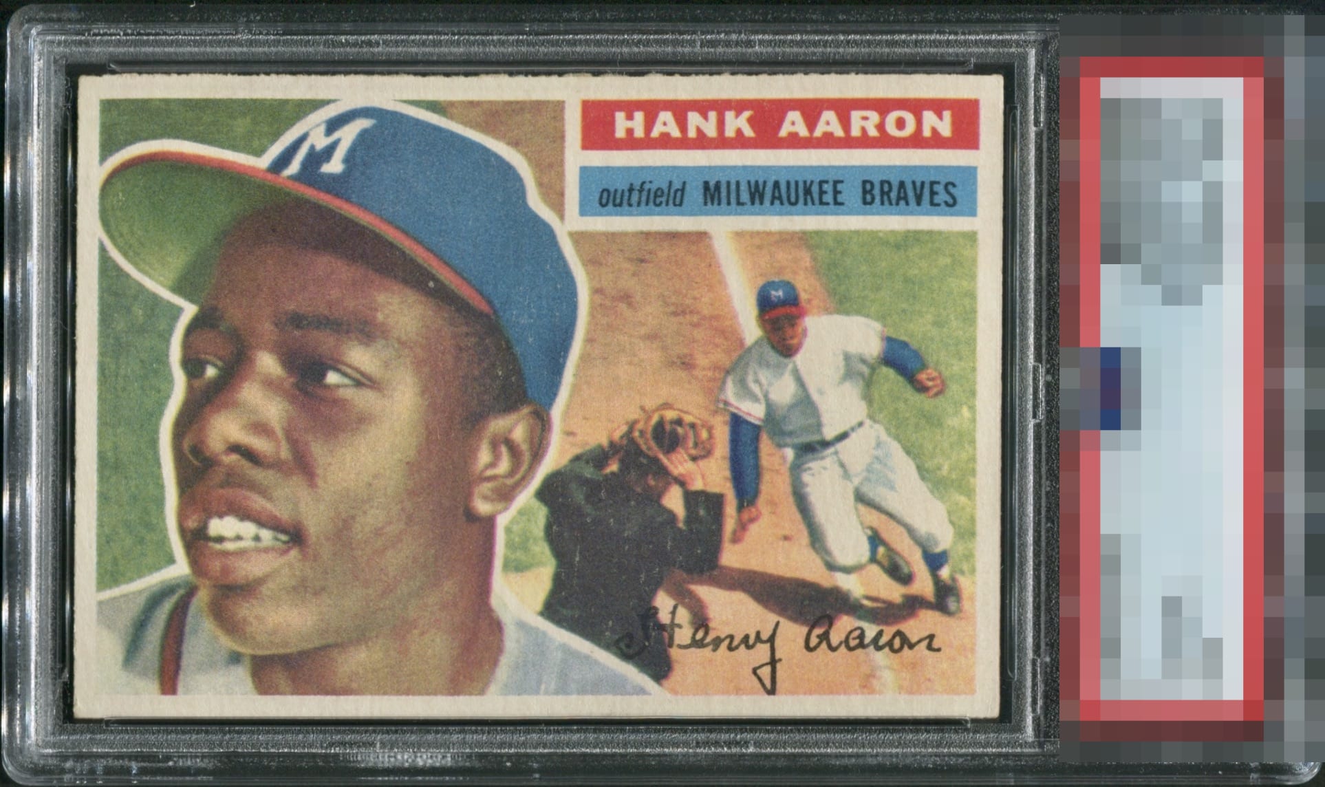
1956 Topps Hank Aaron #31
Reviews & Discussions
12 total reviews

Love the overall impression this makes, and the surface being a bit light is uniform, so I don't really notice it.

Love the centering, and the image looks great as well. Color looks a little faded, but no other issues.

Tiny bit of snow. Could pop a touch more. Maybe the slightest corner touches. Can forgive it all for that 1% centering.

Very, very strong card. Image brightness, or better said lack of brightness, is the only real issue for me.


Centering on this one looks perfect to me and the overall eye appeal is strong. The image looks just slightly dull which holds it back slightly for me.

Nice centering but the colors are dull and there is some snow/wear to the surface.

I a a fan of this card. The Colors, the image, and the strong details. Loses it slightly for off center and slight discoloring of the border. But Great Card to have

This a 500ft homer of eye appeal. Centering, rough cut, even corners. KO's cards well above its weight, too. Some mild surface lightness/PD is all I can detect after a long, enjoyable look.
EyeQ+
EYEQ+ TROPHY CASE


Rating Distribution
12 total reviews
I get that this copy is really well centered (not 50/50) and its clean with nice corners but the color is really lacking. I have to keep this in the B range.