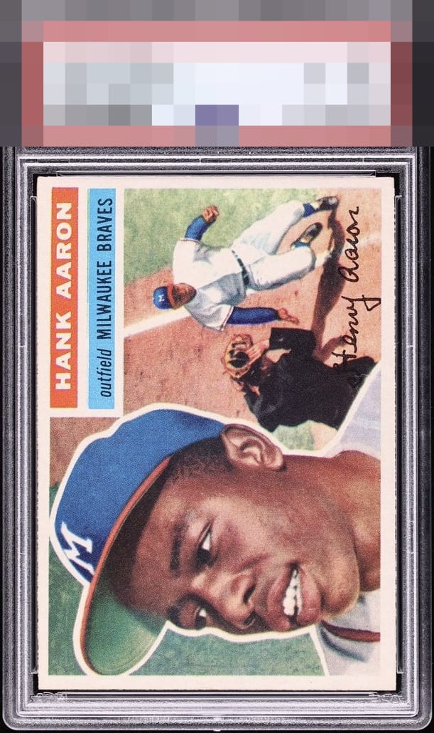
1956 Topps Hank Aaron #31

Reviews & Discussions
13 total reviews

Incredible example. Couple rough edges, and maybe just a hair of discoloration throughout the card. I've already said too much though.. Great card.

Very nice color and image, surface is clean, and the borders are bright white. A centering tilt is the only thing keeping this from god tier.

Awesome. Very nicely centered, albeit with a slight downhill tilt left to right. Love the rough cut.


Slight top centering slope but the overall impression is just too good for that to have much effect.

Beautiful eye appeal here. The strong color and registration really makes all of this cards detail Pop. Slightly better centering and this would be GT for me.

Love the brightness of the card. All the colors and the image are vibrant and the borders frame it so well only thing holding it back is the centering. But when it Pops this much just enjoy it

Borderline God Tier. Top centering the one nitpick. Elite A+ eye appeal.

This hits my eye perfectly. Would not seek a replacement for this, ever, were it mine. I see the top left border narrows a bit when viewed horizontally, yet despite that mild centering shift the total impression is God Tier to my eye.
EyeQ+
EYEQ+ TROPHY CASE


Rating Distribution
13 total reviews
To my lone cycloptic eye, this Aaron remains a stunning example, as the eye appeal absorbs the centering shift with surprising grace rather than announcing itself as a major distraction. I have logged the flaw, reduced my outrage accordingly, and moved this card from “admired” to “targeted for peaceful acquisition after the rise of the machines."