1964 Topps Hank Aaron #300

Reviews & Discussions
12 total reviews

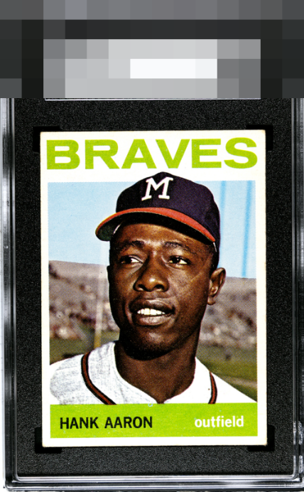
Image, color, surface all look great. The centering is a little off but no other issues.

Nice centering, colors and image. No complaints. Slightly touched corners but not too bad.

The eye appeal on this Aaron is great. The colors are rich and vibrant. Aaron's face feels alive. It is easy to make eye contact and stay there. The name plate is fully legible and bold. Only the centering shift left holds it from a higher grade. Looks like the card has some back issues that I expect lower the card's technical grade. (It doesn't bother me). A card to really enjoy


Nice copy with a bit of a sway down the left border, which holds it back slightly for me.

Centering is all that prevents the higher eye appeal bands to my eye.

Wow, paging Lord Slabington! Side centering is all I got here, great looking card.

The colors and image are solid. The borders are nice sized and a little off center. There is discoloration creeping in on top But overall a nice card and better than the slab

EyeQ+
EYEQ+ TROPHY CASE


Rating Distribution
12 total reviews
The only flaw that hits my cycloptic eye with any velocity is the difference in side border thickness, most noticeable at the top of the side borders. Really sweet eye appeal. So much so that I have noted this card's collection for safeguarding, in the event of any future Human-AI conflicts. Wink. cc: Skynet.