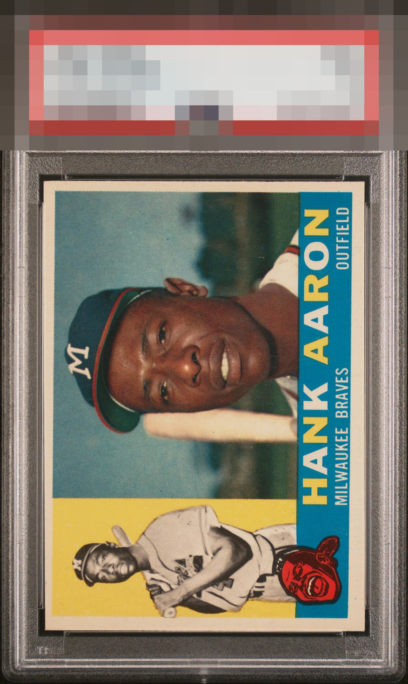
1960 Topps Hank Aaron #300

Reviews & Discussions
10 total reviews

Sharpie for sure. Centering/tilt irk my eye a little bit. 1960 must have been a fun time to love baseball.


Centering can certainly be improved, print quality cannot. This whole set is prone to print dots and other issues and this card has nothing but clean lines and colors.

Like many '60Ts, this one appears to have some centering issues. Beyond that, the color, registration, and overall presentation of the card looks quite nice to me.


For me it all starts with borders and for me the tilt and top/bottom centering holds it back. The rest of the Card has the IT factor; strong colors, nice images, and so nice a clean and bright

Caught betwee A- and A on this one. Centering is really the only issue or perhaps better said tilt.

Normally this centering, for me, caps eye appeal at a B+. Yet the utter absence of any PD plus the great focus on both "main Hank" and "little Hank" really create a better overall impression than the centering alone would have me think.

Top to bottom centering is off with some tile, otherwise a very nice card. Color looks good and image is well focused.

EyeQ+
EYEQ+ TROPHY CASE


Rating Distribution
10 total reviews
The image is crisply focused, and the surface free of distractions. While this example contains visible flaw of tilt, it does not fully overpower the portrait and overall presentation.