1958 Topps Hank Aaron #30

Reviews & Discussions
11 total reviews

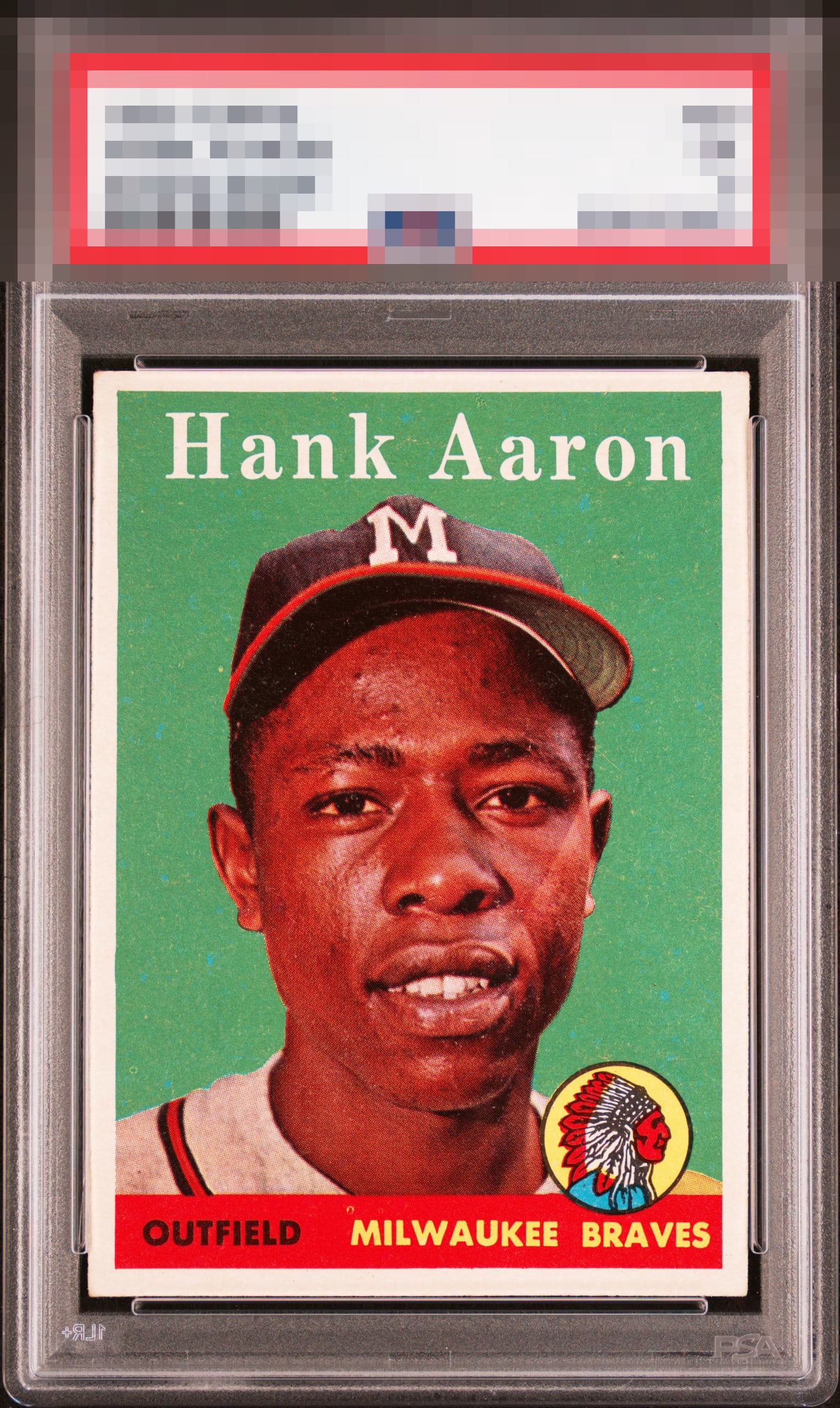
A fantastic 58 Hank here. One that really drops the hammer so to speak. Clean white borders, no tint, beautiful print and color. Loads of pop - just like Hank himself. A hair of tilt, centering and a print dot are all that keep this one from GT in my book. Congrats to this lucky collector!

This is an exceptionally balanced example, the kind of card that becomes more impressive the longer you study it. The centering is the immediate anchor. This copy lands remarkably close to dead center, giving the entire presentation a calm symmetry that feels effortless. The surface quality is notable. Fish eyes are common on this card, yet this copy appears strikingly clean throughout. That uninterrupted surface allows the portrait, nameplate, and color transitions to present with unusual clarity. The nameplate is especially strong: bold, crisp, and beautifully resolved. The Braves logo also carries real brilliance, adding just enough energy to complement the card without overwhelming it. What keeps this example from “popping” is the green coloration, which is more muted than explosive. This is a very settled example. Nothing fights for attention and distracts from the experience. The eye rests comfortably.

This is what I’d be looking for. Nice framing, white borders. Strong color with just minor blemishes.

Wow great colors and strong image and nice size borders. Centering a bit off with a subtle tilt but only if you are looking

Centering and the blue print spots in the green background hold it back for me. Image of Hank is very strong.


This card pops to me. Bold color and image focus carries it almost all the way. Just a touch better centering away from GT for me.

All I can flag is centering and it has a very mild affect on the eye appeal. The rest is great looking.

This pleases my eye and the centering shift or tilt at the top of the side borders impacts eye appeal just a bit.
EyeQ+
EYEQ+ TROPHY CASE


Rating Distribution
11 total reviews
My cycloptic eye detects a small centering shift and faint "visual noise" in the form of PD. I nonetheless determine eye appeal of the highest tier. Well chosen, my human friend.