1958 Topps Hank Aaron #30

Reviews & Discussions
11 total reviews

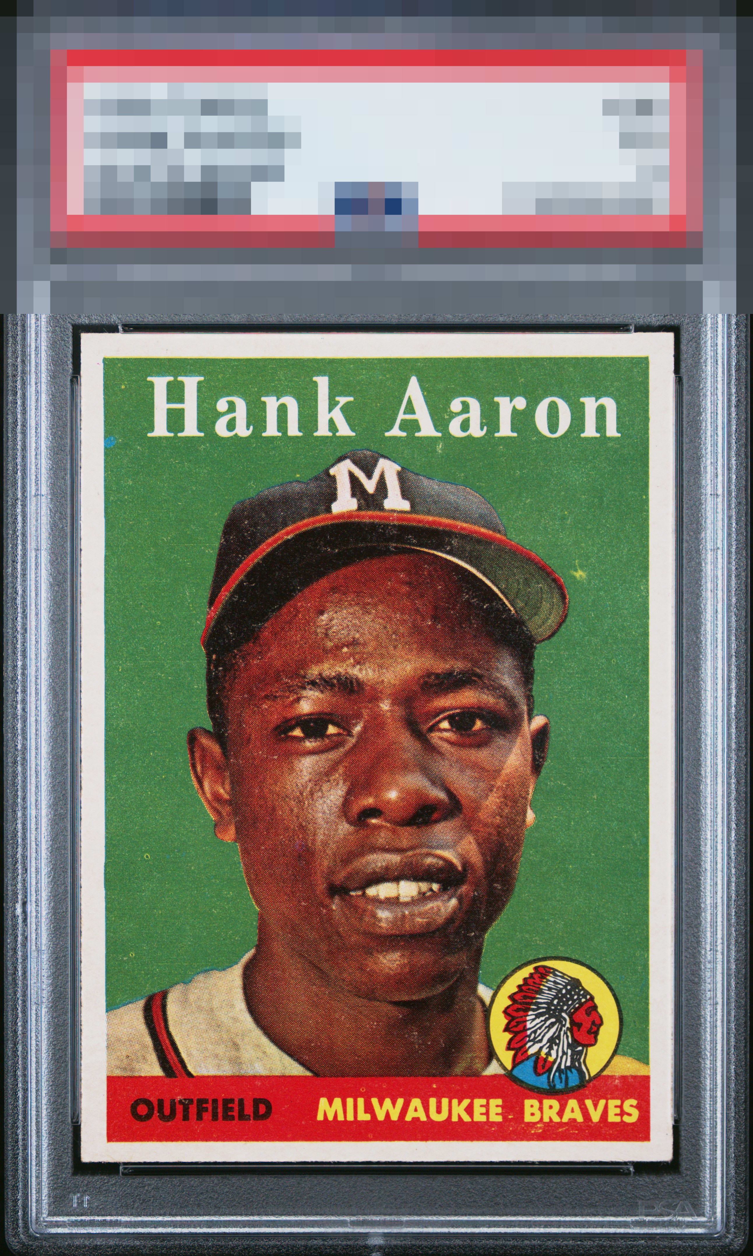
A yellow and blue print defect really jumped out at me. Colour really pops. It’s slightly OC but does not detract from the overall appeal of this card.


Beautifully centered with the only items taking it out of "god tier" are the surface issues which are easily noticeable with the solid green background.

Torn between A- and A eye appeal on this one. Certainly top tier, no question. Once again shows me why they say, "Buy the card, not the grade." The mark near his cap bill plus the centering make me say A-. Remove one of those and A. Great looking card!

Here the whole is greater than the mere sum of the parts. The surface concedes generalized PD and the centering is admittedly not dead nuts, and yet it all undeniably pleases my eye very much.

Great centering and deep green background but there is some surface wear that distracts.


This is a Wow card. It has strong colors and image. Minor surface wear. The borders and nice and clean and bright

Beautiful card. Deep green color and great white borders. The speck next to his hat and the centering lowers it a touch.
EyeQ+
EYEQ+ TROPHY CASE


Rating Distribution
11 total reviews
Solid centering and bold colors, but a bit too much surface defect for my liking