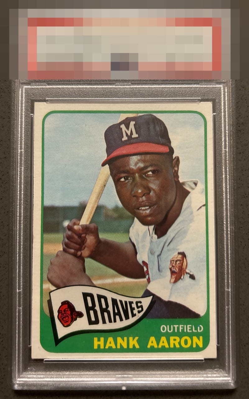
1965 Topps Hank Aaron #170
1 / 2

💬
Reviews & Discussions
5 total reviews

A classic A- for me as all I notice its centering to the right, and then a corner with a longer looks-- but the overall vibe is sweet and that trumps all details.

centering is off and creates a tilt towards the top But I really like the colors and the image of the card and it is clean


Top Tier for me as only a touch of centering and corner wear emerge on a long look.
5 reviews

0 reviews
EyeQ+
--
Global Population
3
POPULATION ACROSS ALL GRADES AND GRADING COMPANIES
Global Eye Rank
—
No Eye Q+ score
Population in Grade
1
POPULATION IN THIS GRADE ACROSS ALL GRADING COMPANIES
Eye Rank in Grade
—
No Eye Q+ score
EYEQ+ TROPHY CASE

GLOBAL

IN-GRADE
Trophies appear here when earned.
📊
Rating Distribution
5 total reviews
G
0%
A+
0%
A
0%
A-
3 ratings
60%
3
B+
2 ratings
40%
2
B
0%
B-
0%
C+
0%
C
0%
C-
0%
D+
0%
D
0%
D-
0%
F
0%
Very sharp example