1954 Topps Hank Aaron #128
1 / 2
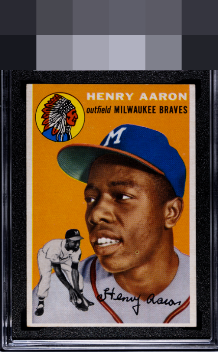
Click to enlarge
💬
Reviews & Discussions
10 total reviews

Very good eye appeal that would be even higher minus the fish eye. Low centering factors in to a lesser degree.

Thin bottom border is noted and a badly placed fish eye but wonderful card.

The color and image look great, but once I noticed that fish eye on his cheek my eye is drawn to it every time I look at the card. Centering is off top to bottom as well.


The image and colors are very strong. A touch low on the centering. The fisheye on his face does detract a lot from the card for me.

Centered low but I am very impressed with the evenness of the side borders; sway on those side border sizes really disproportionately affects eye appeal to me on this card. No issues otherwise. Top tier looks!
Locked
3 reviews
EyeQ+
120.0
Global Population
44
POPULATION ACROSS ALL GRADES AND GRADING COMPANIES
Global Eye Rank
#31
Population in Grade
4
POPULATION IN THIS GRADE AND GRADING COMPANY
Eye Rank in Grade
#3
EYEQ+ TROPHY CASE

GLOBAL

3rd Place
IN-GRADE
📊
Rating Distribution
10 total reviews
G
0%
A+
0%
A
1 rating
14%
1
A-
2 ratings
29%
2
B+
3 ratings
43%
3
B
1 rating
14%
1
B-
0%
C+
0%
C
0%
C-
0%
D+
0%
D
0%
D-
0%
F
0%
Beautiful coloring with no background speckling or roller marks is nice. TB centering with the facial print dot keep it from the top levels. Nonetheless, a nice Hank