1973 Topps Hank Aaron #100

Reviews & Discussions
14 total reviews

Tried to find something wrong with this one and couldn’t do it! GT all day!

Technical grade needs to be ignored on this gorgeous piece of art/cardboard

I don't see a flaw, even the corners are sharp. Not sure how the grade is only a 6, but the eye appeal is god tier.

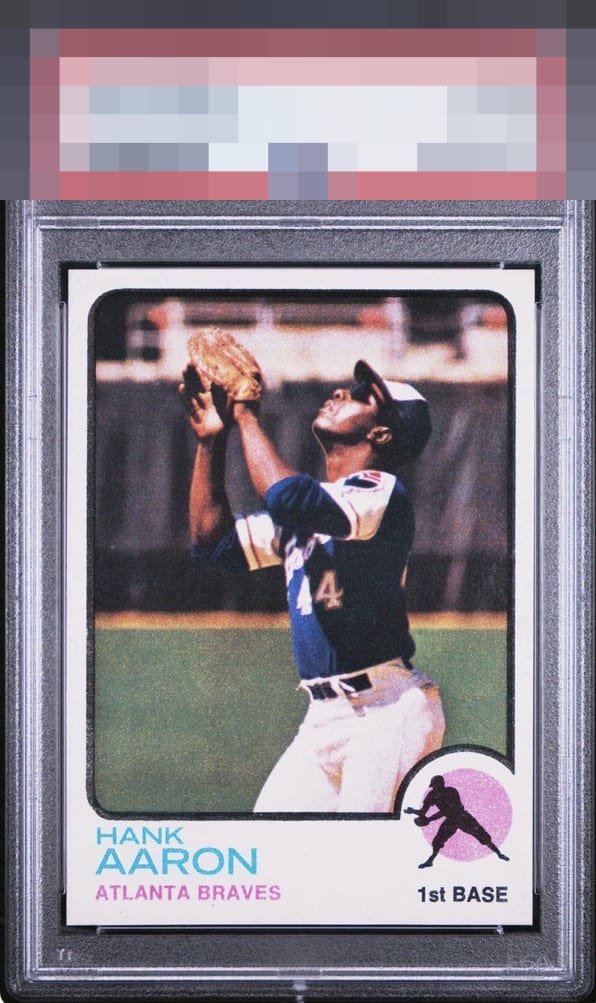
At first glance this example is God Tier. A closer read, especially against stronger counterparts I have seen, narrows the verdict. The pink circle behind the batter is a touch washed, softening the card’s usual snap. The left black border does not resolve to a true, inky black, and along the top frame the left and right segments present a shade lighter than the top and bottom, creating a faint halo effect at the corners. Even with those nuances, the card carries itself with poise. Registration is confident, centering feels disciplined, and the overall presentation has undeniable presence. On pure eye appeal it lands just shy of God Tier, but the scarcity and known difficulty of the issue merit a promotion in spirit. Final call: High A+ for eye appeal, elevated by context, and a card any focused collection would be proud to showcase.

I am seeing some awesome freaks of eye appeal on this site. This card is up there with the freakiest freaks.

This card rips the clothes off the Grading Company Emperors. This card looks GEM FREAKING MINT. What a massive win for the collector. Blows away 9s and 10s that look identical and cost a ton more. Whatever the cause fo the grade, if we cannot see it, is it really "there?" Insert standing ovation GIF here.

Spent more time looking at this card because of the slabbed grade. Normally do not but I cannot understand it. I See a well centered(not perfect) bold clean and bright borders and really nice image and color. This is as Perfect as I have seen of this card

If there is a flaw here, it does not rise to the level where I can see it, and thus care about it. That is what eye appeal is about; it only counts if it bothers my eye. God Tier eye appeal on this Hammerin' Hank.

I'll take it! Just kidding. Wow, this is a beauty. There are just no flaws that leap out and nag my eye, whatsoever. When I stare at a card for several moments and nothing detracts from the eye appeal, the longer that lasts the higher the badge grade. I'm still staring, 100% eye satisfaction. The centering is perfection. The corners are sharp, too. Growing up, this was my favorite Aaron card. Punches way above its weight, as I am sure its eventual EyeQ+ score will reflect.
EyeQ+
EYEQ+ TROPHY CASE


Rating Distribution
14 total reviews
Gem Centering and corners. With brilliant white color on the borders. With just touch brighter color on the pink circle and black borders this one could rate even higher.