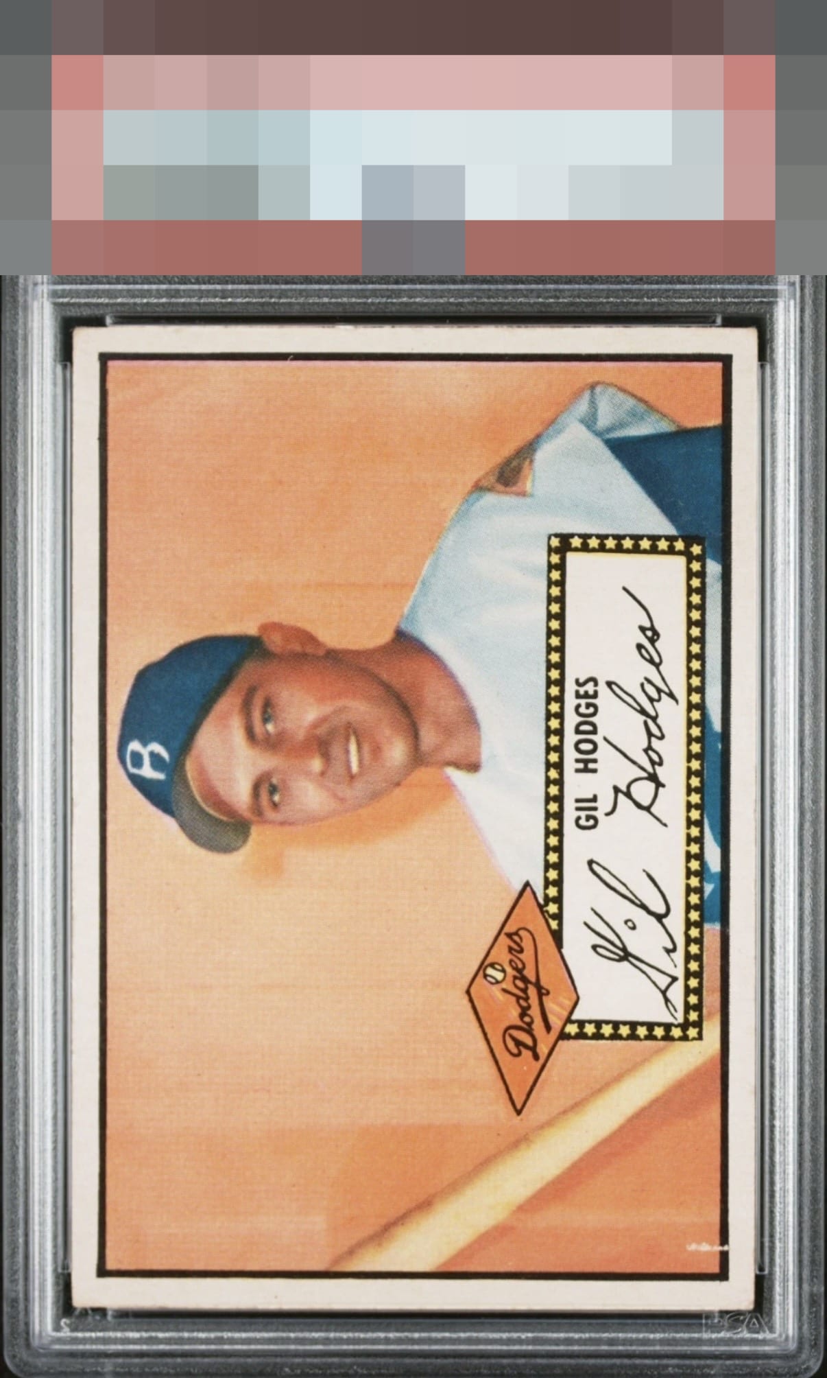
1952 Topps Gil Hodges #36
1 / 2
Click to enlarge
💬
Reviews & Discussions
3 total reviews

nice card with nice subtle colors that works and the image stands tall. the paper loss on the left distract from the card but does not hurt the overall enjoyment

Other than the small paper loss on the bottom left the card looks great. Well-centered with a nice image

3 of 7 reviews

0 reviews
EyeQ+
--
Global Population
1
POPULATION ACROSS ALL GRADES AND GRADING COMPANIES
Global Eye Rank
—
No Eye Q+ score
Population in Grade
1
POPULATION IN THIS GRADE AND GRADING COMPANY
Eye Rank in Grade
—
No Eye Q+ score
EYEQ+ TROPHY CASE

GLOBAL

IN-GRADE
Trophies appear here when earned.
📊
Rating Distribution
3 total reviews
G
0%
A+
0%
A
0%
A-
3 ratings
100%
3
B+
0%
B
0%
B-
0%
C+
0%
C
0%
C-
0%
D+
0%
D
0%
D-
0%
F
0%
Love this example. Top tier eye appeal, and the mild tilt nudges my eye more than the lower left mark.