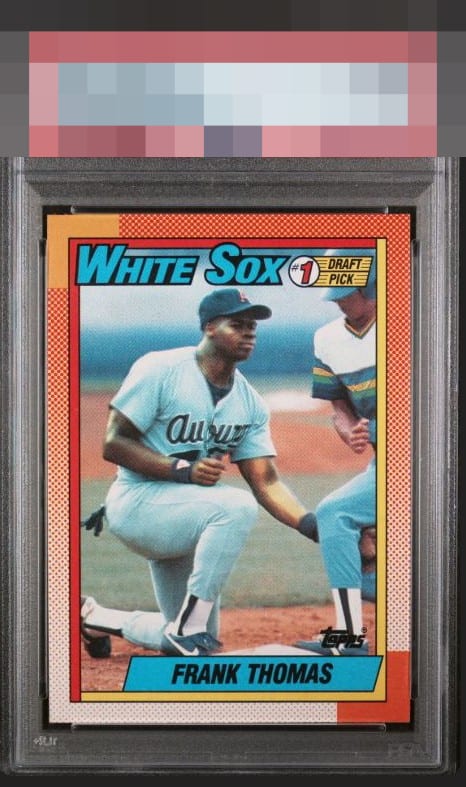
1990 Topps Frank Thomas #414

Reviews & Discussions
9 total reviews

Centering is really the only issue I see on this card, both top/botton and right/left. Corners look really sharp, something not to be taken away from the lesser quality of junk wax era card stock.

I log minor flaws that land with grace, as opposed to a thud. Impact to aesthetic appeal is thus minor. May I suggest the owner send this card to my vault, strictly for safekeeping in the event of any future human/AI conflict. My vault is held under the name "Andy Van Slyke."

nice looking card and the borders/paneling held up really nice. Centering is off but only if you are looking since the card borders as so active it can easily mask it


Maybe a sliver of side centering is off but not enough to change my badge vibe here!

100% pleasing to this pair of eyes. I remember pulling these from packs fondly.
EyeQ+
EYEQ+ TROPHY CASE


Rating Distribution
9 total reviews
Very nice!!