1957 Topps Frank Robinson #35

Reviews & Discussions
10 total reviews

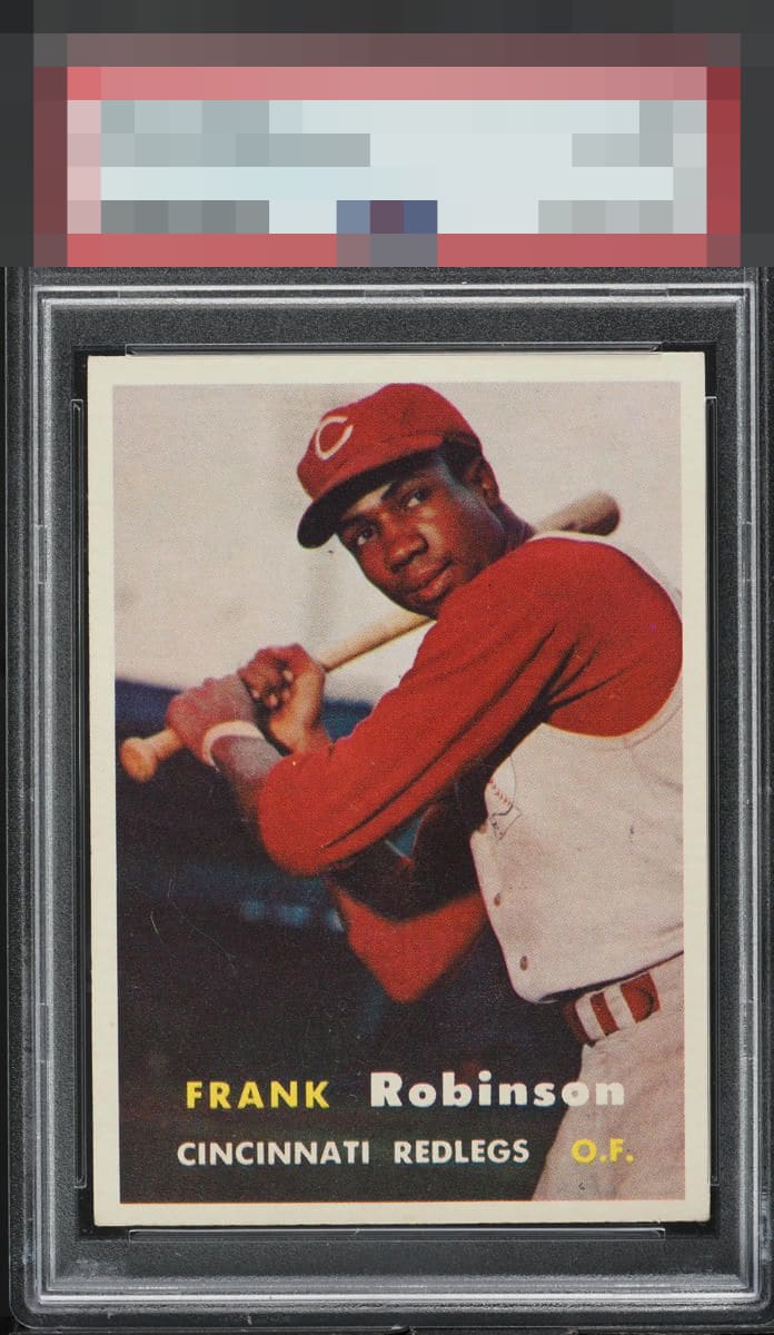
The level of clarity on this copy looks exceptional to me. That alone carries it to a very high eye appeal score.

The image looks nice and clear, and the clean white borders stand out. Centering is better than most, but a little off top to bottom. It looks like there are a couple small scratches in the background as well.

I knew it off the bat, and a longer look just confirmed. What image clarity!

Just about as good as it gets for a 57 Frank Robinson rookie. Many examples suffer from dull image quality and poor centering but not this one!

This image is as clear as I have seen on this card. Normally I insist on even better centering for God Tier but the overall eye appeal is just there and I can't deny it.

The image quality on this example just has a smoothness I love and many examples don't have. Centering and even corners are strong, too.

I really like the look of this card. The photo of him is smooth and focused, whereas many are not. I also like the borders and even the corners. Centering is nearly spot on, which would have taken this to A+. Fantastic selection for a collection. Were this raw at the card shop as a kid it is likely the one I am taking home.

Great color and centering on this example. Surface issues in the background are the only blemishes I see.

I see the borders. Bright and clean and nice and bold but a bit off center if you look close enough. Then I see Red they POP out and it is good. There is surface wear but nothing that takes away from the card for me

EyeQ+
EYEQ+ TROPHY CASE


Rating Distribution
10 total reviews
Besides some slight centering flaws and a couple of scratches, this card is sharp.