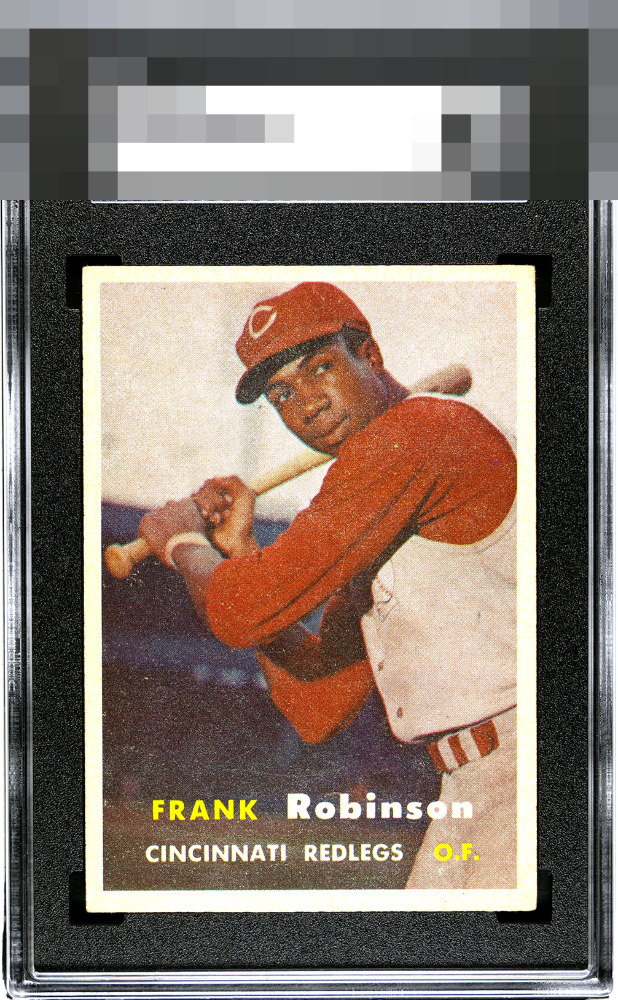
1957 Topps Frank Robinson #35
Reviews & Discussions
13 total reviews


Great centering is what stands out here. Some obvious issues within the borders but a strong example here


Punches above its weight, though concedes some northward centering and the common 1957 Topps patina/print surface that makes the image not as clear as a lucky few examples.

This card stands as a rare find, especially with such impressive centering. The snowflaking, while present, is a common trait for this issue and does little to diminish its charm. Its clean white borders frame the image with precision, and the print quality holds strong, giving it a crisp, appealing presence. You don't find this card centered, even in a 7-8 grade.

love the borders and the brightness of them. Love the image but the colors are not crisp and lots of white speckling effecting the overall image
EyeQ+
EYEQ+ TROPHY CASE


Rating Distribution
13 total reviews
Surface wear pulls down the appeal.