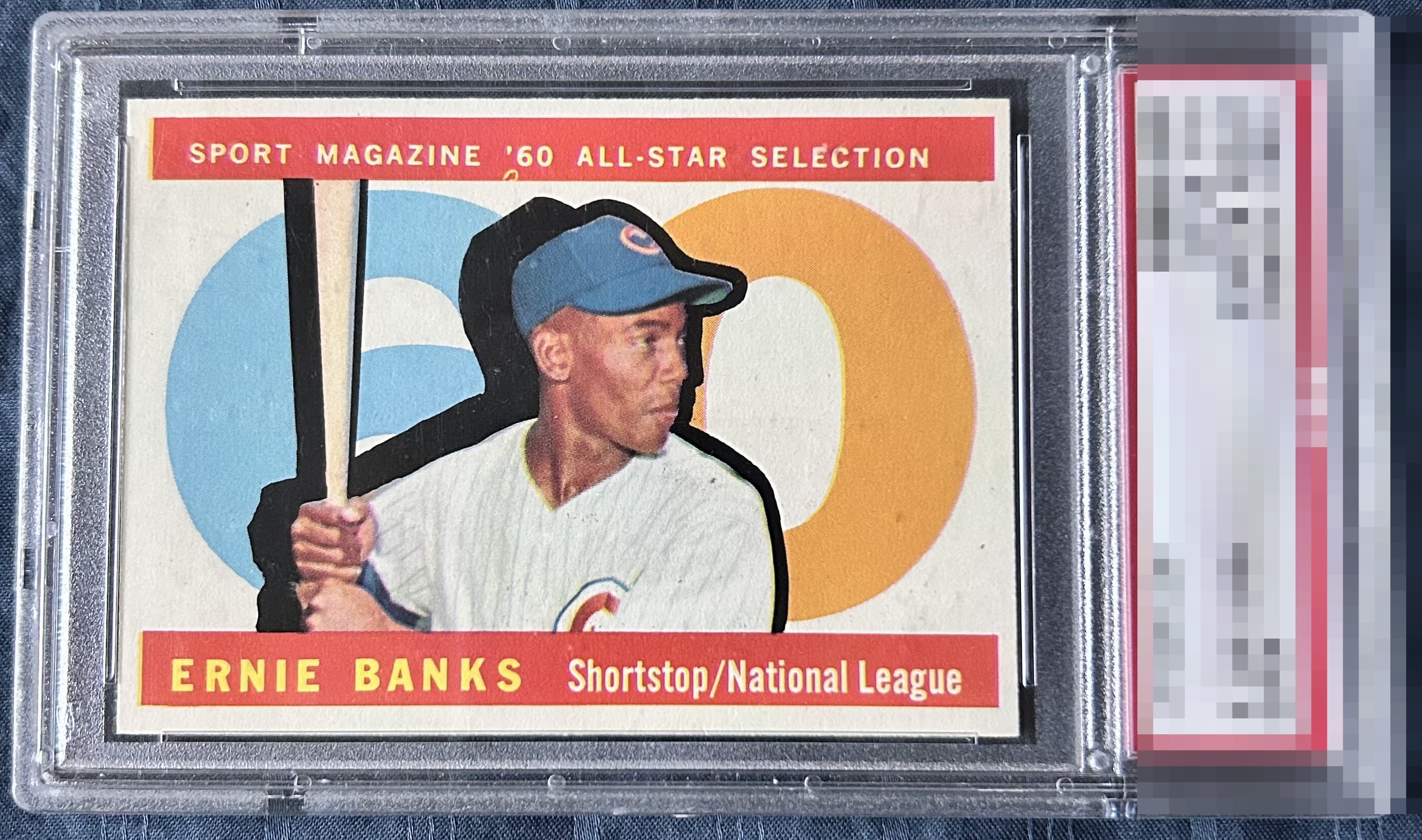
1960 Topps Ernie Banks #560

Reviews & Discussions
8 total reviews

I log minor flaws that land with grace, as opposed to a thud. Impact to aesthetic appeal is thus minor. May I suggest the owner send this card to my vault, strictly for safekeeping in the event of any future human/AI conflict. My vault is held under the name "Andy Van Slyke."

Looks NM+ with a couple surface issues all that’s noticeable. Clean card.

Very nice card here. Slight centering issues but otherwise excellent.

Centering is the main issue. Fisheye in the top red bar and some PD are noticeable. Very nice colors.

Great looking card The image jumps of the page and the colors are sharp There is a centering opportunity but on a horizontal card it is only noticeable if you look Great card to just enjoy

Strong eye appeal here. The print dot/fish eye under the "'60" and a very mild centering shift to the right are the only detracting factors for me.
EyeQ+
EYEQ+ TROPHY CASE


Rating Distribution
8 total reviews
Presents extremely well