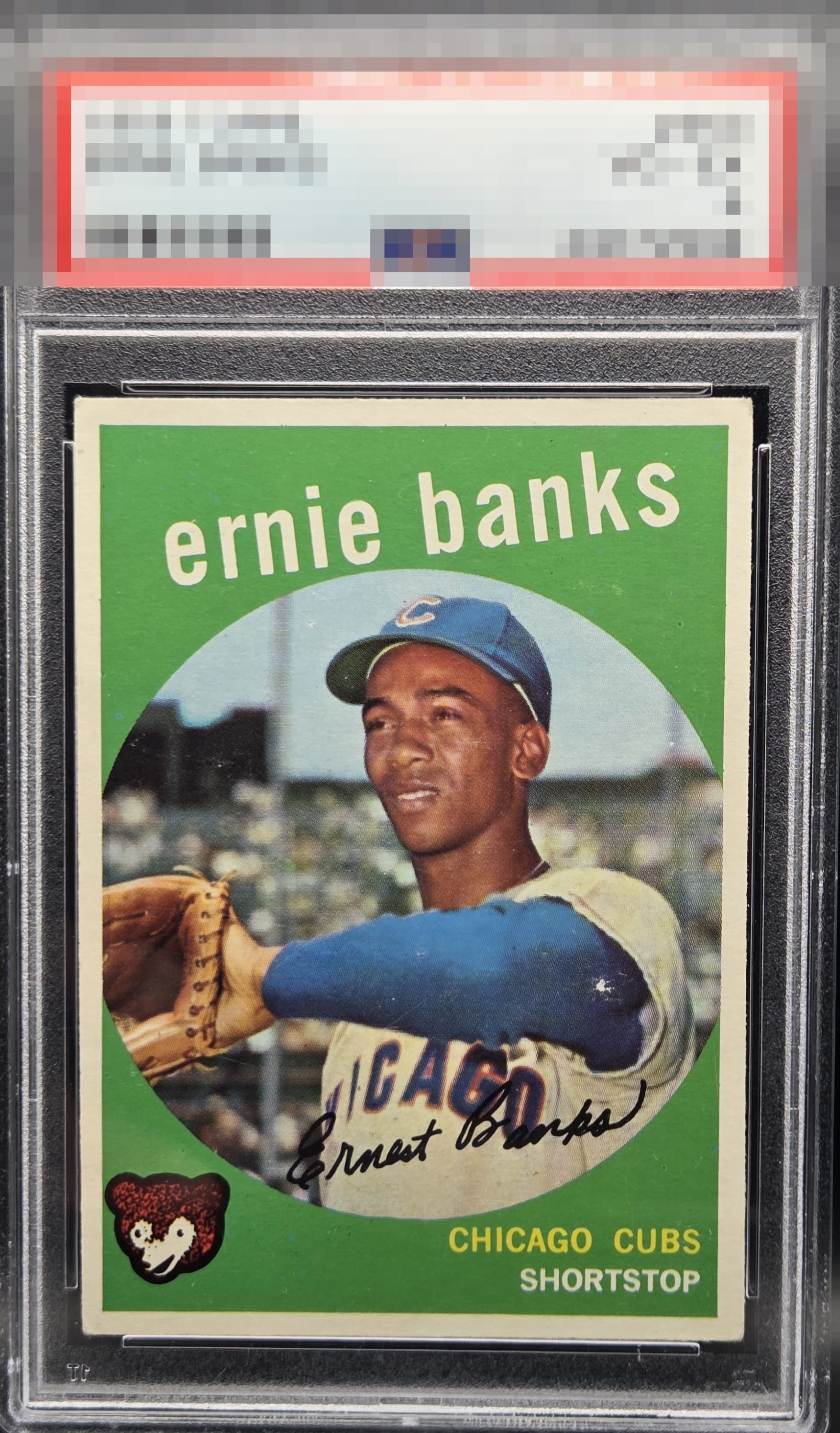
1959 Topps Ernie Banks #350
1 / 2
Click to enlarge

💬
Reviews & Discussions
9 total reviews

Centering tilt and some surface wear keeps this below A tier, but it still presents well and has nice color.


The spot on the sleeve almost looks like it belongs. The card also has other speckling but it all blends in The strong image and the centering and the colors make for a great card

Some surface wear especially on the blue sleeve draws my eye. Very well-centered with good color. Presents nicely even with the flaws.

Wow, it really took me a few seconds of staring and enjoying the card to see the elbow scuff. That tells me a lot about the eye appeal. The centering, image, and color-- heck, even corners-- are are pretty here. Bravo.
Locked
2 reviews
EyeQ+
126.0
Global Population
2
POPULATION ACROSS ALL GRADES AND GRADING COMPANIES
Global Eye Rank
#1
Population in Grade
1
POPULATION IN THIS GRADE ACROSS ALL GRADING COMPANIES
Eye Rank in Grade
#1
EYEQ+ TROPHY CASE

1st Place
GLOBAL

1st Place
IN-GRADE
📊
Rating Distribution
9 total reviews
G
0%
A+
0%
A
0%
A-
3 ratings
43%
3
B+
4 ratings
57%
4
B
0%
B-
0%
C+
0%
C
0%
C-
0%
D+
0%
D
0%
D-
0%
F
0%
For my eye and a 60+ year old card, the is eye appeal. The centering, corners, colors, and clarity makes this the definition of what an old baseball card should look like. Were not aiming for perfect, were aiming for eye appeal and this one has it.