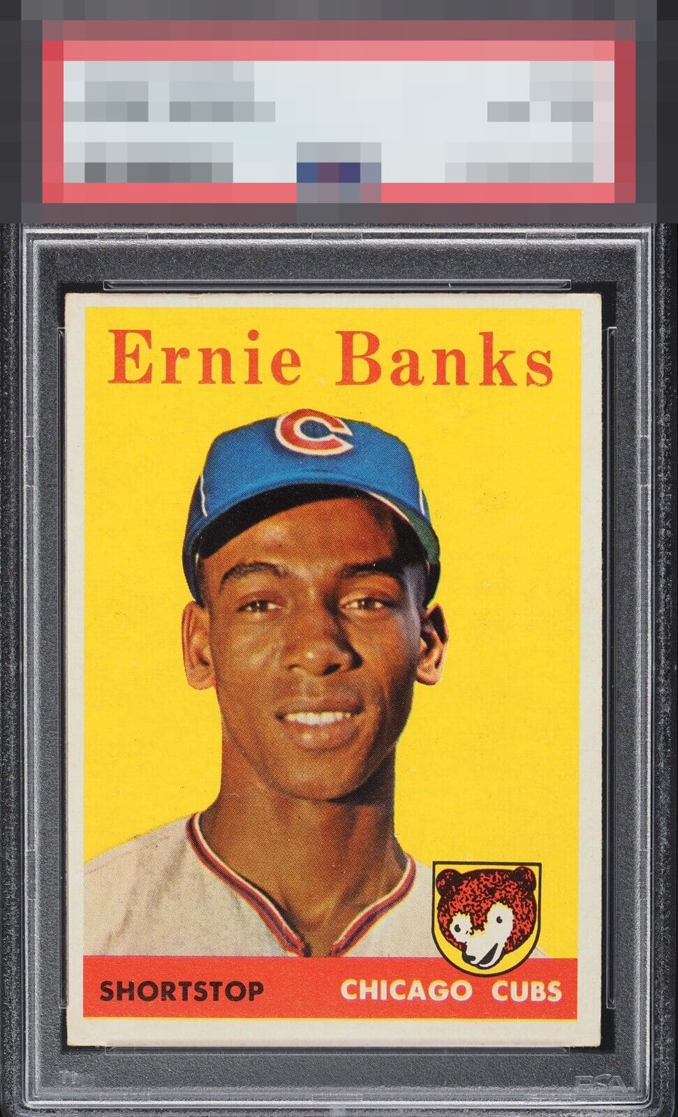
1958 Topps Ernie Banks #310

Reviews & Discussions
10 total reviews

Centering is my only note but it does distract my eye a bit. Great color and registration.

The bright yellow background still pops and the image is clear. Centering and tilt keep this just below A tier for me.

Normally this centering would create a B+ ceiling but the color, surface, and overall appeal is so nice it slips into the VIP section!

The yellow really pops and the image of Mr. Cub is striking. Only drawback is the centering but this is a great example.


Normally I would care more about the centering but in this case the card overall just is too pretty.

High eye appeal of B+ for me and all that holds this back from the very top tier is the centering. Fantastic color and the yellow is so clean.

Glad I am not color blind. Love the Colors and the Contrast of them and love how the image POPs And Wow comes with a cute cub This is an enjoyable card and a keeper

Nice bright yellow background with a focused image. A few minor white spots in the yellow. Centering is the main thing that holds it back.

EyeQ+
EYEQ+ TROPHY CASE


Rating Distribution
10 total reviews
Diamond cut / tilt is bothering me more than usual here. Otherwise, excellent.