1955 Topps Ernie Banks #28
1 / 2

💬
Reviews & Discussions
5 total reviews

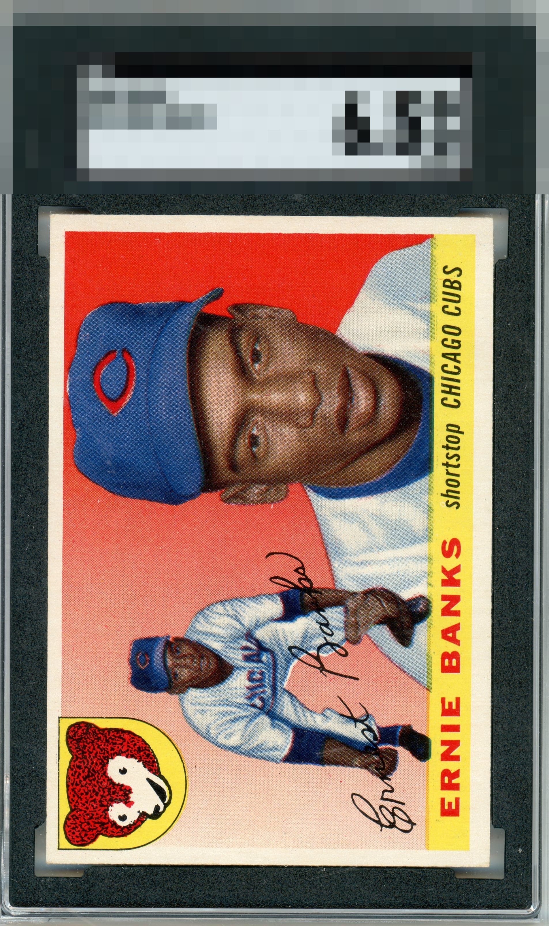
Love the colors and the image and it all POPS Centering is off and the borders cause a tilt in the card But with the card being so busy with details the centering is subtle

Centering is all I've got here, a little off both ways. Strong eye appeal overall.

Very nice color and image. A bit of surface wear. Centering could be better.
4 reviews
1 review
EyeQ+
--
Global Population
2
POPULATION ACROSS ALL GRADES AND GRADING COMPANIES
Global Eye Rank
—
No Eye Q+ score
Population in Grade
1
POPULATION IN THIS GRADE ACROSS ALL GRADING COMPANIES
Eye Rank in Grade
—
No Eye Q+ score
EYEQ+ TROPHY CASE

GLOBAL

IN-GRADE
Trophies appear here when earned.
📊
Rating Distribution
5 total reviews
G
0%
A+
0%
A
0%
A-
2 ratings
50%
2
B+
2 ratings
50%
2
B
0%
B-
0%
C+
0%
C
0%
C-
0%
D+
0%
D
0%
D-
0%
F
0%
Strong copy, very nice