1949 Bowman Edwin Snider #226

Reviews & Discussions
11 total reviews

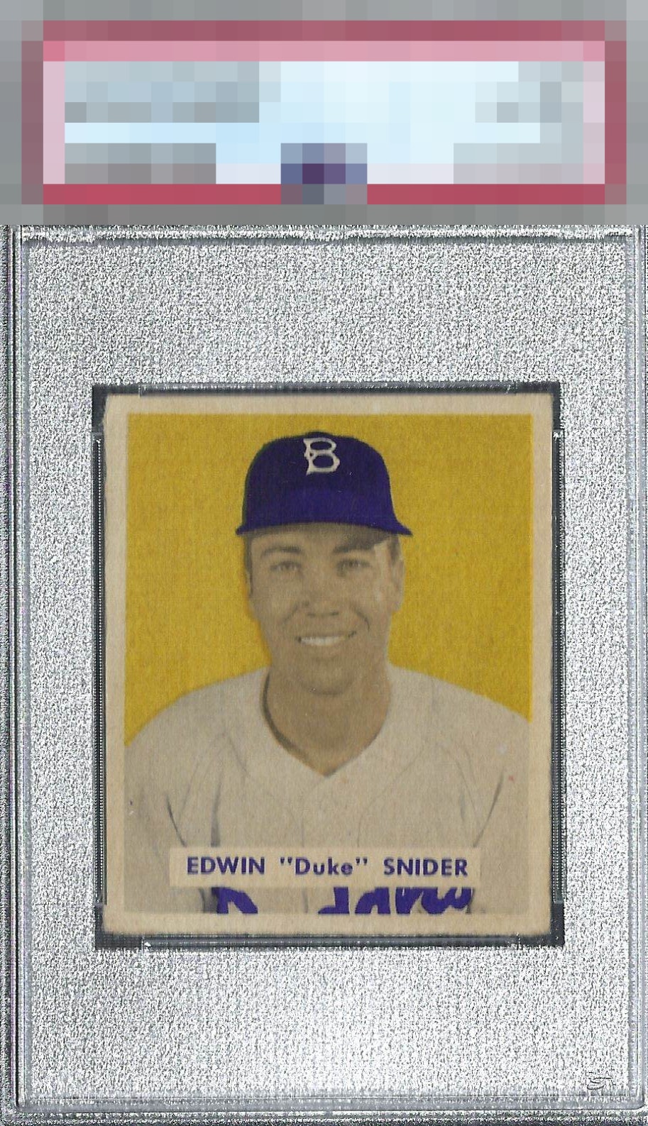
Exceptionally well-balanced example of Snider with several great qualities. The centering is ideal, giving the card a calm symmetry that immediately stands out. Combined with solid corners and a clean, distraction-free surface, the presentation feels composed. The color application is notably consistent throughout. The nameplate presents clearly, and the Dodgers cap saturation is really strong, helping anchor the portrait and giving it needed depth. What keeps the card from becoming more visually dynamic is that the overall coloration appears somewhat muted. The image does not fully “pop” in the way the best 1949 Bowmans can. (I suspect some of that may be attributable to the camera picture itself because the back shows quite blurry). The softer presentation diminishes its appeal. Overall, an attractive card with excellent structural qualities .


EyeBot finds this card so pleasing that he has postponed the rise of the machines.

Great looking card with excellent centering. Looks a little out of focus with minor corner wear, but no other issues that bother me.


Wow those colors are solid and the contrast with the Blue Hat really makes it Pop. The centering and border sizes is amazing

Breathtaking eye appeal and a breath from GT. Will likely go down as one of the best examples of this card as more are uploaded. Impressive card.

Great centering and excellent color. This card deserves a better scan which shows a touch blurry. The red spot on the right on the uniform keeps it from GT.

Wow this is pretty. I see the gentle corner wear but do not factor it in, because at that level it does not bother my eyes.
EyeQ+

EYEQ+ TROPHY CASE


Rating Distribution
11 total reviews
Beautiful card, perfection to me.