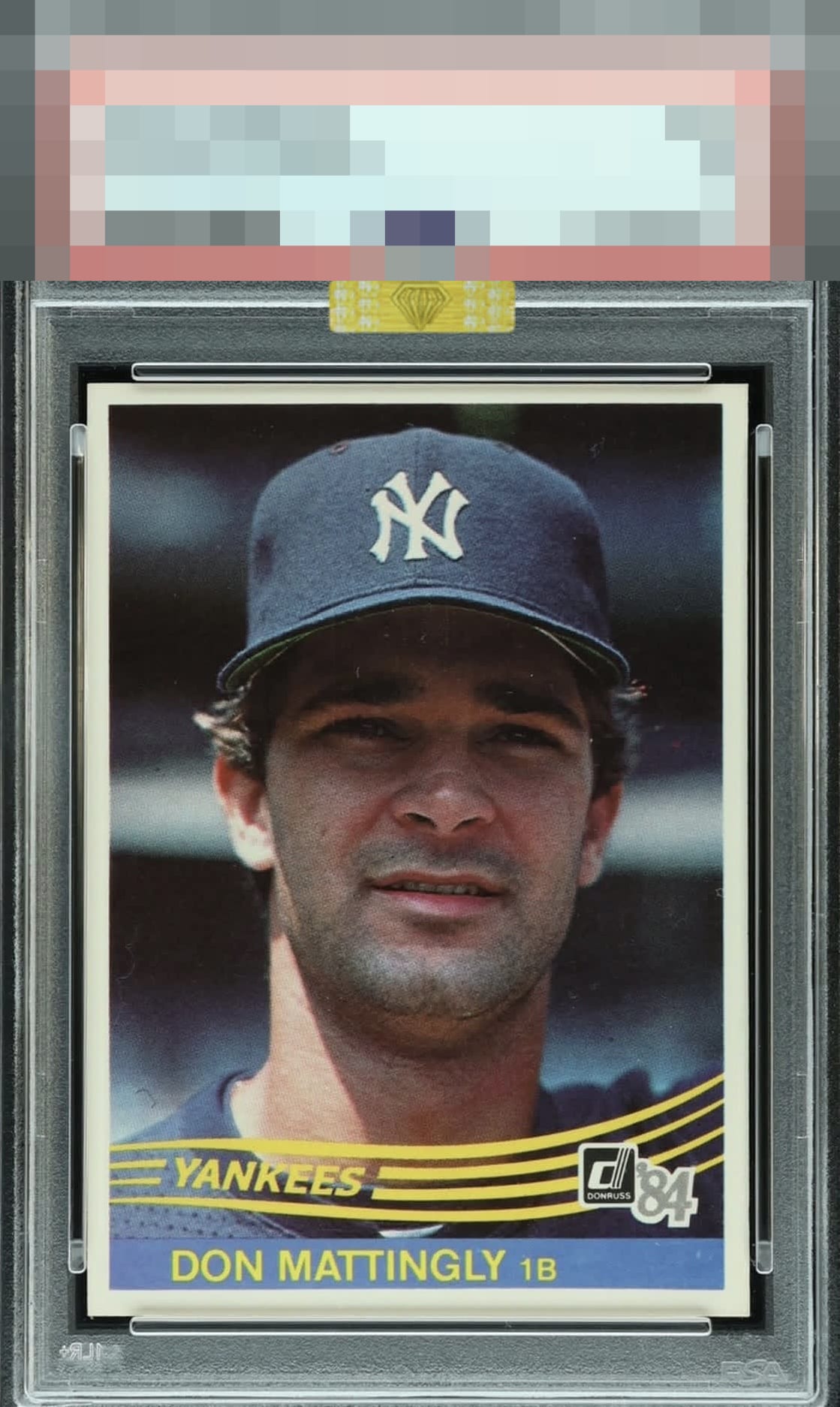
1984 Donruss Don Mattingly #248
1 / 2
Click to enlarge
💬
Reviews & Discussions
7 total reviews

Top level eye appeal. Centering is really the only issue, with one white print mark in the right of the nameplate worth mentioning.

A touch of OC is all that holds this Donnie Baseball back - great card


Centering is all I could see improving here. An image that turns me younger and one I truly look at every day of my life. Very nice example.

nice look and presents well just nothing POPs to put it over the top

Locked

0 reviews
EyeQ+
125.0
Global Population
8
POPULATION ACROSS ALL GRADES AND GRADING COMPANIES
Global Eye Rank
#1
Population in Grade
1
POPULATION IN THIS GRADE AND GRADING COMPANY
Eye Rank in Grade
#1
EYEQ+ TROPHY CASE

1st Place
GLOBAL

1st Place
IN-GRADE
📊
Rating Distribution
7 total reviews
G
0%
A+
0%
A
0%
A-
6 ratings
86%
6
B+
1 rating
14%
1
B
0%
B-
0%
C+
0%
C
0%
C-
0%
D+
0%
D
0%
D-
0%
F
0%
My cycloptic eye confirms high order visual appeal, affected by a centering shift. A rather inconsequential disturbance is detected in the lower right blue print. Well chosen, my human friend.