1959 Topps Don Drysdale #387
1 / 2
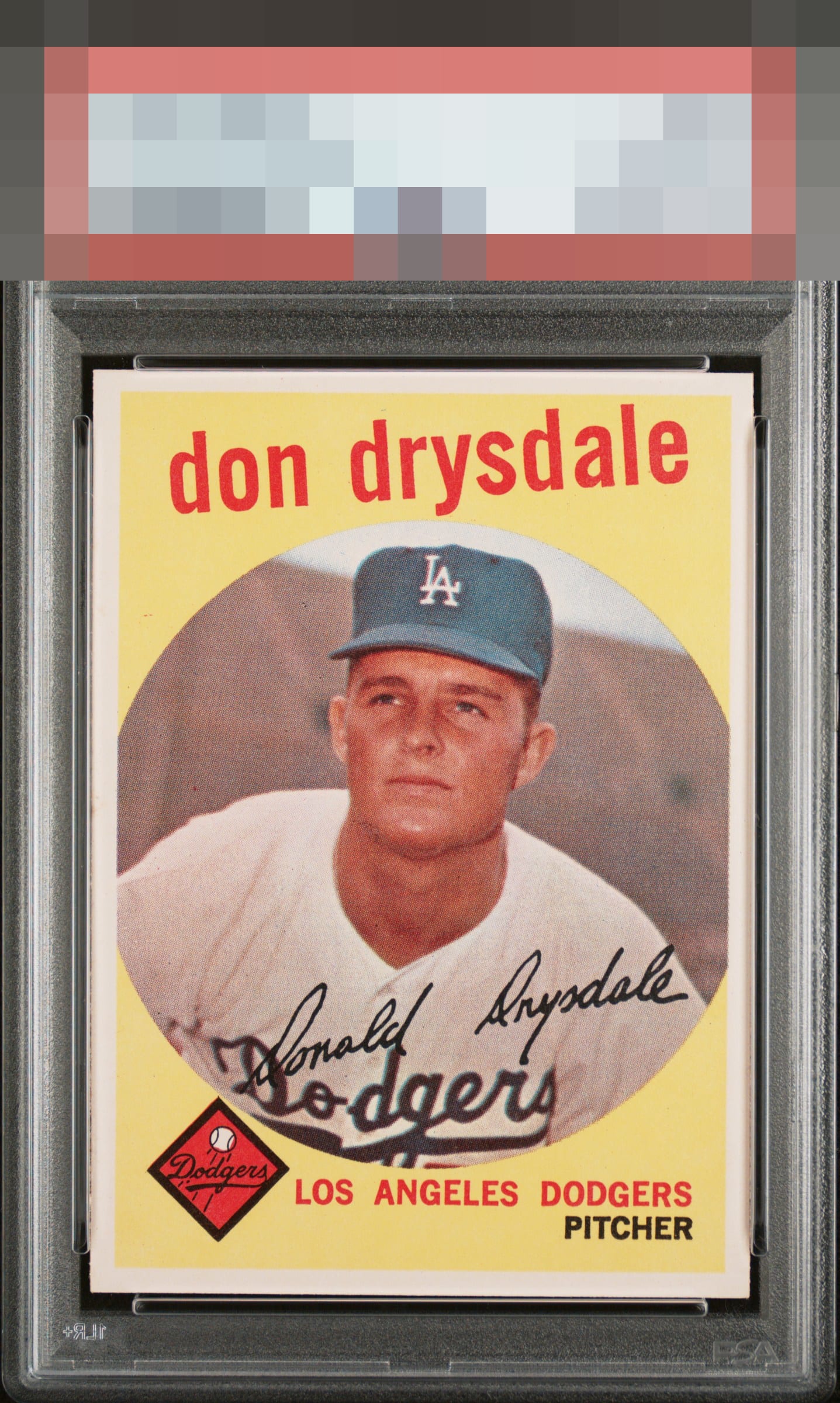
Click to enlarge
💬
Reviews & Discussions
6 total reviews

Centering shift and slight tilt is noted but print, colors, and corners are very nice as is the eye appeal

very nice looking copy and the colors and image really work together. nit pick on the centering but good for me

Impressive card to enjoy here with my morning coffee. Not one thing about it bumps my eye. Beautiful.


5 of 7 reviews
1 review
EyeQ+
--
Global Population
1
POPULATION ACROSS ALL GRADES AND GRADING COMPANIES
Global Eye Rank
—
No Eye Q+ score
Population in Grade
1
POPULATION IN THIS GRADE AND GRADING COMPANY
Eye Rank in Grade
—
No Eye Q+ score
EYEQ+ TROPHY CASE

GLOBAL

IN-GRADE
Trophies appear here when earned.
📊
Rating Distribution
6 total reviews
G
1 rating
20%
1
A+
2 ratings
40%
2
A
2 ratings
40%
2
A-
0%
B+
0%
B
0%
B-
0%
C+
0%
C
0%
C-
0%
D+
0%
D
0%
D-
0%
F
0%
Well chosen, my human friend. EyeBot detects flaws that are assigned gentle weight, as they do not offend my aesthetic sensor.