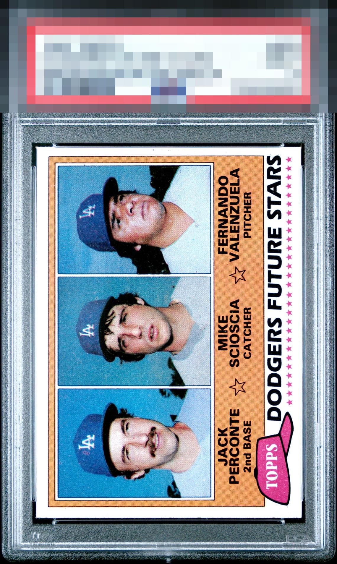
1981 Topps Dodgers Future Stars #302
1 / 2

💬
Reviews & Discussions
12 total reviews


Really well centered with sharp corners. A technical beauty with nice balance. Only the softer color and less than sharp registration hold it from a higher grade for me

Centering in both directions keep this from higher grades. All other aspects are fantastic.


Clean card but has some PD. A bit off-centered. Minor flaws but holds the card back a bit.

I mean... centering? That's all I got here, fellas. Damn sharp and handsome Fernando RC!

Not a fan of the series of cards. Nothing Pops but it is clean and looks good for how they wanted to produce these
10 reviews
2 reviews
EyeQ+
100.0
Global Population
1
POPULATION ACROSS ALL GRADES AND GRADING COMPANIES
Global Eye Rank
#1
Population in Grade
1
POPULATION IN THIS GRADE ACROSS ALL GRADING COMPANIES
Eye Rank in Grade
#1
EYEQ+ TROPHY CASE

1st Place
GLOBAL

1st Place
IN-GRADE
📊
Rating Distribution
12 total reviews
G
0%
A+
5 ratings
50%
5
A
1 rating
10%
1
A-
3 ratings
30%
3
B+
1 rating
10%
1
B
0%
B-
0%
C+
0%
C
0%
C-
0%
D+
0%
D
0%
D-
0%
F
0%
My cycloptic eye has scanned many examples of the Fernando RC. This is among the most aesthetically pleasing I have encountered. I shall note this card's location for safeguarding in the event of any future human-AI conflict. Just kidding! cc: Skynet.