1975 Topps Dave Winfield #61
1 / 2
💬
Reviews & Discussions
3 total reviews

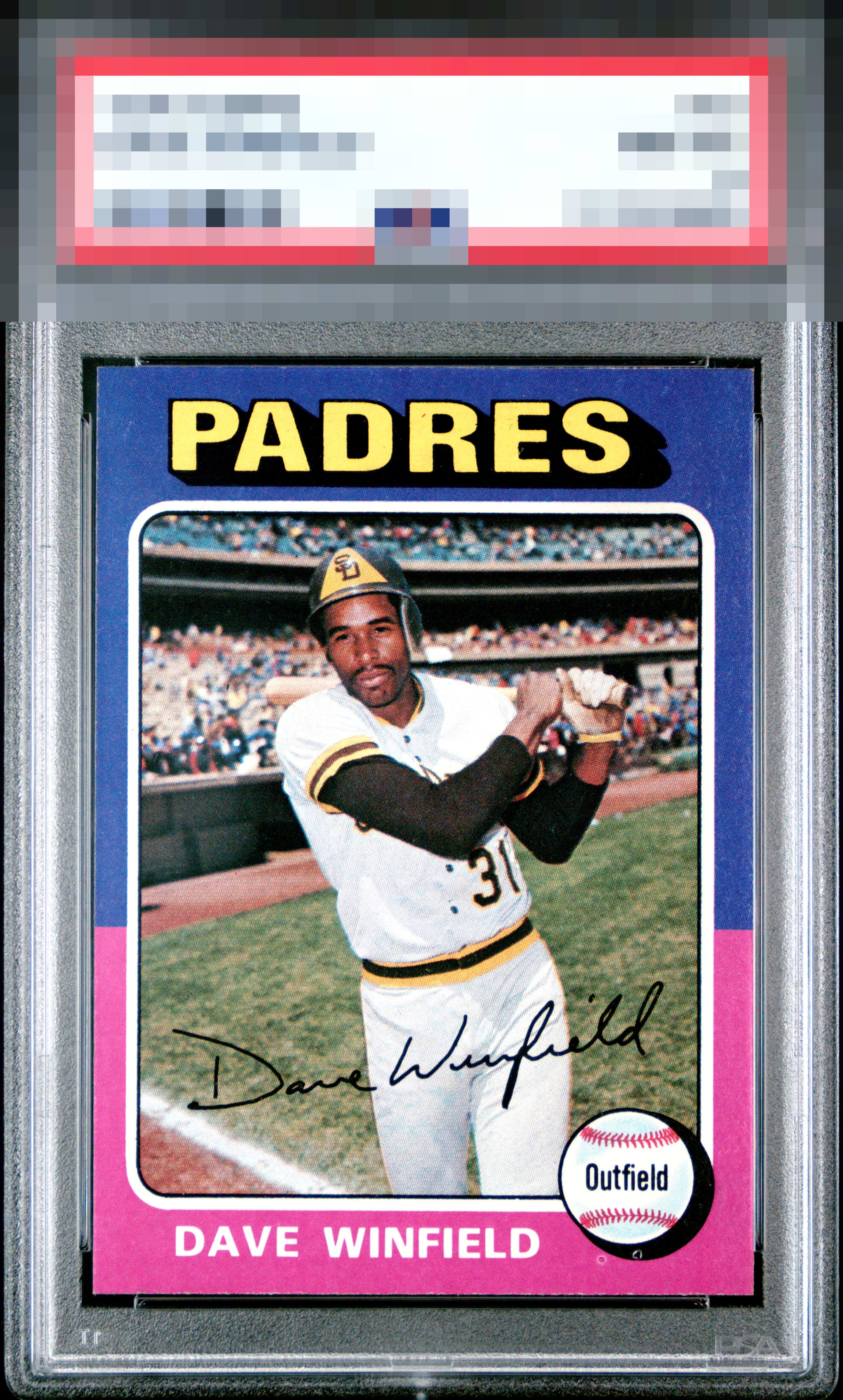
Great looking card but held back by the borders to much color inconsistency as well as the fishes on bottom right and the surface wear on the borders and that affects how sharp the card looks The image is really solid looking

Colors are strong. The fisheyes underneath the baseball are noticeable. Other than that, everything looks great.
3 reviews

0 reviews
EyeQ+
--
Global Population
1
POPULATION ACROSS ALL GRADES AND GRADING COMPANIES
Global Eye Rank
—
No Eye Q+ score
Population in Grade
1
POPULATION IN THIS GRADE ACROSS ALL GRADING COMPANIES
Eye Rank in Grade
—
No Eye Q+ score
EYEQ+ TROPHY CASE

GLOBAL

IN-GRADE
Trophies appear here when earned.
📊
Rating Distribution
3 total reviews
G
0%
A+
0%
A
0%
A-
2 ratings
67%
2
B+
1 rating
33%
1
B
0%
B-
0%
C+
0%
C
0%
C-
0%
D+
0%
D
0%
D-
0%
F
0%
Strong eye appeal. One of my favorite 1970s cards right here! The PD under the baseball is the only aspect that tugs at my eye.