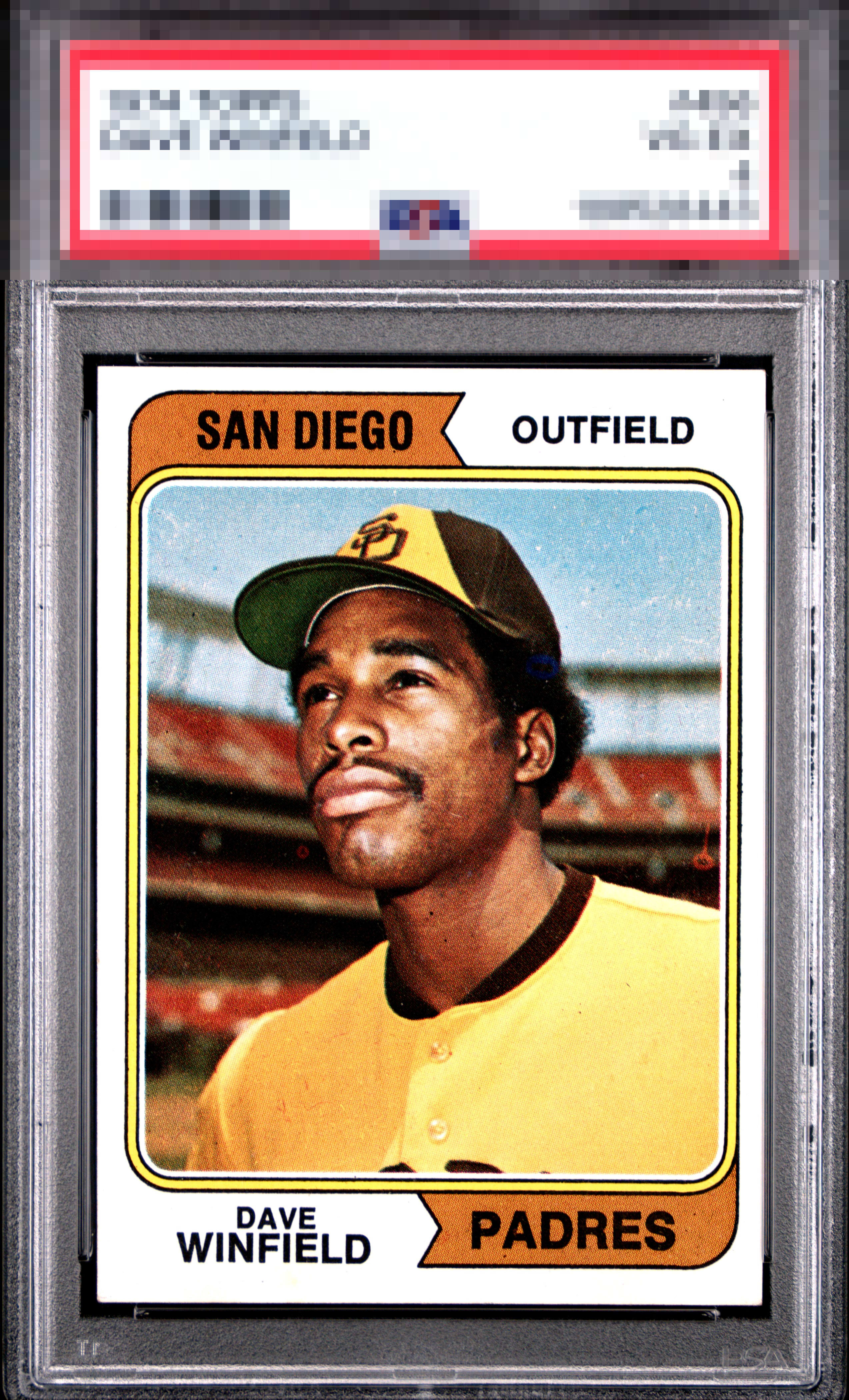
1974 Topps Dave Winfield #456
1 / 2
💬
Reviews & Discussions
7 total reviews


This one presents beautifully, with sharp print registration and a clean, bright white that gives the whole card a crisp, confident look. The only real distraction is a handful of minor imperfections on the San Diego banner, and while the centering runs a touch high with a slight drift to the right, it still holds together well in the hand. Overall, it is an excellent card with strong eye appeal and only small flaws keeping it from an A-.

Centering toward the right is the only issue on what is otherwise a fantastic looking card! Paging Lord Slabington for this one!

Centering opportunity but not that dramatic but the card looks pack fresh I would proudly put this card in my collection

6 reviews
1 review
EyeQ+
--
Global Population
3
POPULATION ACROSS ALL GRADES AND GRADING COMPANIES
Global Eye Rank
—
No Eye Q+ score
Population in Grade
1
POPULATION IN THIS GRADE ACROSS ALL GRADING COMPANIES
Eye Rank in Grade
—
No Eye Q+ score
EYEQ+ TROPHY CASE

GLOBAL

IN-GRADE
Trophies appear here when earned.
📊
Rating Distribution
7 total reviews
G
0%
A+
0%
A
0%
A-
2 ratings
33%
2
B+
2 ratings
33%
2
B
2 ratings
33%
2
B-
0%
C+
0%
C
0%
C-
0%
D+
0%
D
0%
D-
0%
F
0%
Always loved these weird Padres colors. To the point that I own an inaugural Nate Colbert jersey. 🤷🏻♂️ This is a nice Winfield rookie. But some surface fuzz an centering distract a bit.