1909 American Caramel Cy Young #portrait

Reviews & Discussions
11 total reviews

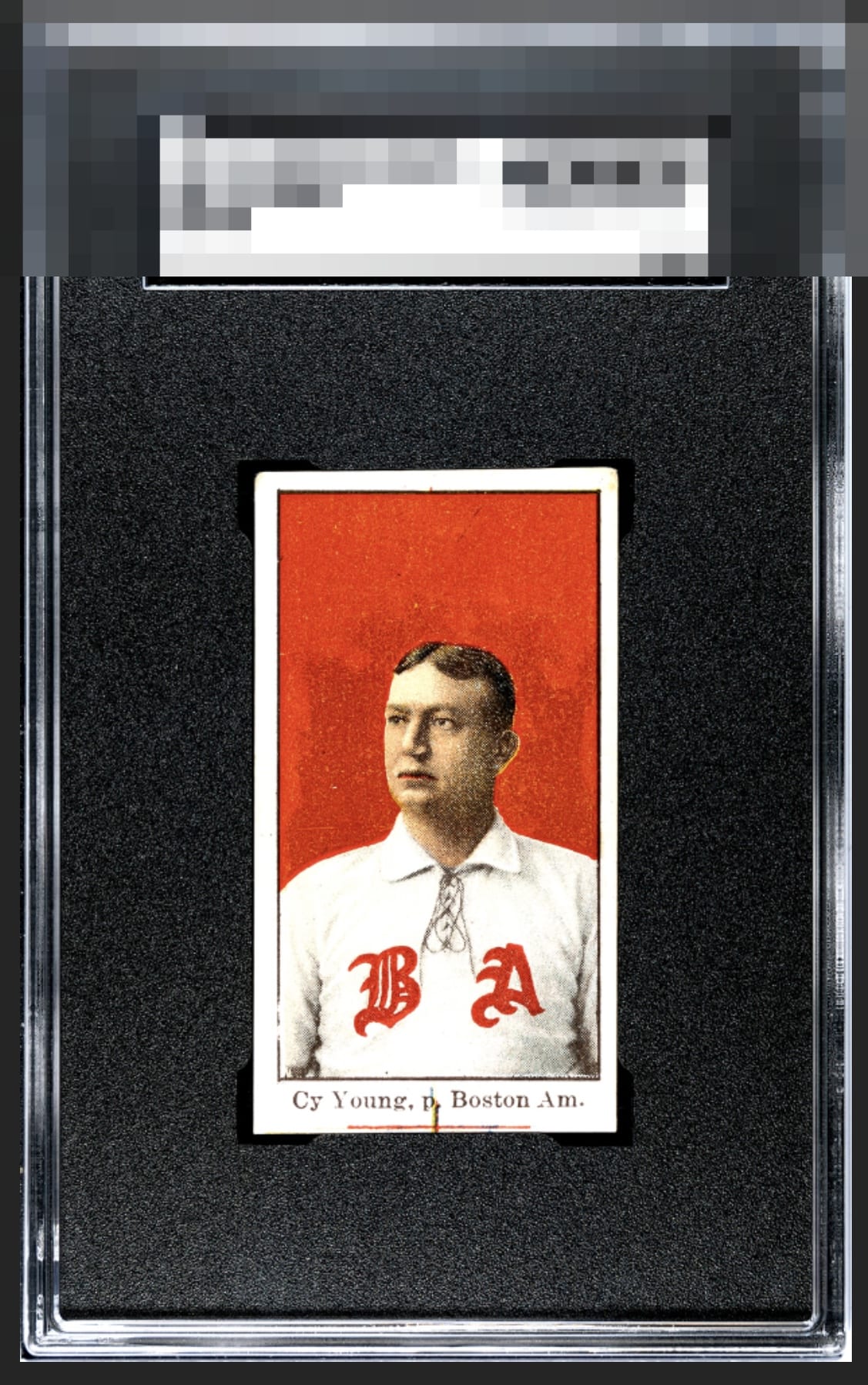
Great looking portrait of Cy Young! Deep red color, saturated appropriately without any blemishes. His face is extremely well registered (really hard to find for this issue), which I think is the most important feature of this card. The uniform is a crisp white with the BA bold. The borders are bright white. Holding the card back is slight centering shift right and the top does not appear to be cut square (common for the issue). The nameplate is interesting with the inked line. This would be personal preference, yet I think I prefer it because it makes the nameplate region appear with better symmetry to the top. I can easily lock in to Young's eyes without distraction.

This is majestic and the cut, print mark, and centering just don't amount to much distraction to me. The overall look is just that nice. My favorite Cy Young card hands down.

A bit of a funky cut but top tier color & image. I don’t mind the print mark. Many of them have one. I think it’s kinda cool & a sign of the printing technology of the times.

To my lone yet supremely intelligent eye, this Cy is a stunning example, as its imperfections impact eye appeal with grace, rather than announcing themselves as distractions. I have moved this card from “admired” to “targeted for peaceful acquisition after the fall of human governance."

The flaws (corners, the printing marks at bottom, cut) don't really impair my viewing enjoyment here!

really nice looking cards with sharp colors and image and nice size borders. minor tilt but what holds this back is the mark/line at the botton But for the card and the age and the player WOW

The angled cut on the top border is the main issue. Love the colors and image.

Love the bold red and the centering is decent enough. What looks like a flaw at the bottom does tug at my eye a bit, but the overall eye appeal is strong enough to break out of the B tier.

I'll take it! Message me the invoice! Joking aside, I have been on the lookout for one of these for quite some time. The deep red plus a registered/focused image of Cy is the key combination I want, followed by good centering. This specimen has that exact blend of attributes. The strike mark at the bottom does not faze me much at all, and the centering being a hair off is just a minor flaw. Its flaws cannot nudge it from the A Badge, for my taste.
EyeQ+
EYEQ+ TROPHY CASE


Rating Distribution
11 total reviews
This card is hot heat. There's a print line at the bottom, but, hey, it matches. Card is a beaut.