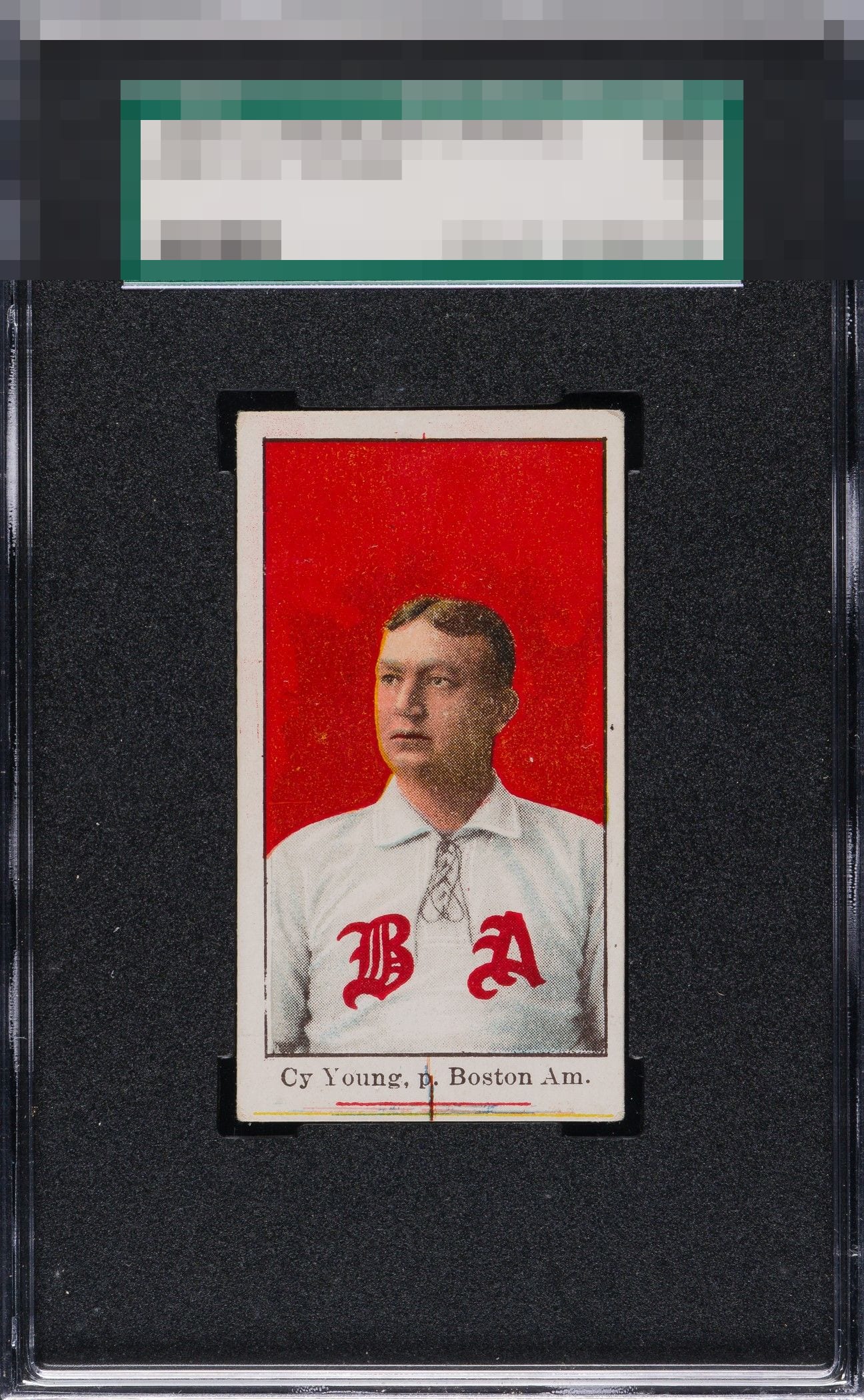
1909 E90-1 American Caramel Cy Young

Reviews & Discussions
14 total reviews

Oh yeah. This card is often a mess but not this one. Exceptionally bold color & the print mark is common, desired by some. Beauty.

Gorgeous red. It has its flaws: scratches on cheek, yellow color fringe on the edge of his face, off-centeredness and something going on bottom middle edge. As an aside, this card is incredible.

Love this card. This one only has centering and some print flaws around his face that bump me a little.

Beautiful example. Just what looks like a slight centering issue and a bit of what appears to be snowing, most noticeable to me around his face.

What a perfect specimen of a 100+ year old card. That background pops like crazy.

The centering and the markings at the bottom do nag my eye, but the rest of the card is just so arrestingly beautiful, the eye appeal remains top tier to me. The star of the e90-a Cy is the subject image and that red; here both of those core aspects are outta sight!

This is my favorite Cy Young card. Lot R centering is off. The lines at the bottom do not detract. Centering and a couple hiccups in the red paint are my only fuss.

What a card. Colors, sharpness of the image. I love it. The mark at the bottom doesn't detract for me.

I really like the look of the Sharp Colors and strong image and the bright white borders. But the marking at the bottom border and thru his name are something that I personally cannot look past. Many positives but those lines holds it down
EyeQ+
EYEQ+ TROPHY CASE


Rating Distribution
14 total reviews
That mark over the "p" is in a place. You can't miss it. The rest of the card is pretty stunning. "A+" worthy. So two demerits for the mark.