1967 Topps Carl Yastrzemski #29
1 / 2
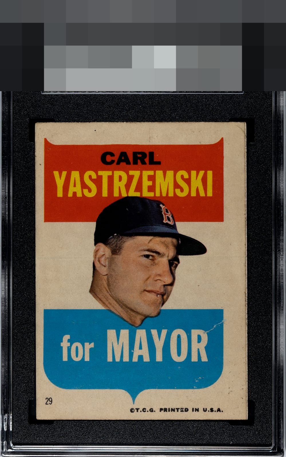
Click to enlarge

💬
Reviews & Discussions
7 total reviews


Average eye appeal zone here with centering, one prominent wrinkle, and diffuse wear/toning/soiling making impact. The image can still be largely enjoyed, and his face and the red name plate being so clean buoy the eye appeal rather well.



5 of 7 reviews
2 reviews
EyeQ+
--
Global Population
1
POPULATION ACROSS ALL GRADES AND GRADING COMPANIES
Global Eye Rank
—
No Eye Q+ score
Population in Grade
1
POPULATION IN THIS GRADE ACROSS ALL GRADING COMPANIES
Eye Rank in Grade
—
No Eye Q+ score
EYEQ+ TROPHY CASE

GLOBAL

IN-GRADE
Trophies appear here when earned.
📊
Rating Distribution
7 total reviews
G
0%
A+
0%
A
0%
A-
0%
B+
0%
B
1 rating
20%
1
B-
0%
C+
2 ratings
40%
2
C
2 ratings
40%
2
C-
0%
D+
0%
D
0%
D-
0%
F
0%
Nice color, but centering, creases, and the right edge make this one pretty average