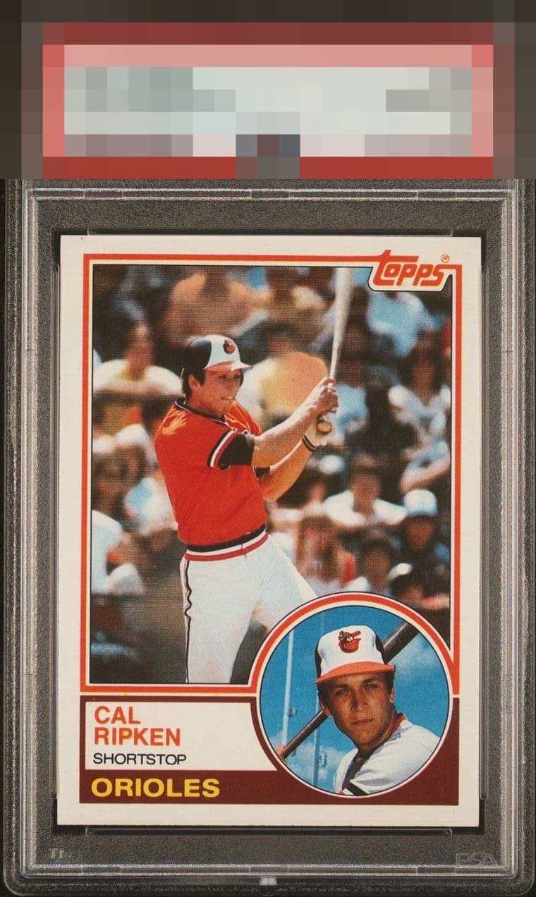
1983 Topps Cal Ripken Jr. #163

Reviews & Discussions
10 total reviews

A slight centering shift is detected and makes proportionate impact on visual appeal.


Great looking card. My eye is drawn to a very subtle tilt/centering opportunity. Beyond that this looks like a very high eye appeal copy to me.

Just sitting a little crooked in the holder is all. This card has no eye appeal flaws to me at all.

The card has great colors and sharp image. Centering could be a touch better.

Everything to love on this card. IF you look really really close you can see some centering opportunity but it is well within my acceptance Wow again send MattyC the invoice and me the card

A click of centering, visible when comparing the width of the side borders, from GT eye appeal. My favorite Cal card alongside the Traded.

EyeQ+
EYEQ+ TROPHY CASE


Rating Distribution
10 total reviews
Dead centered, sharp corners, great image. A beast of a card.