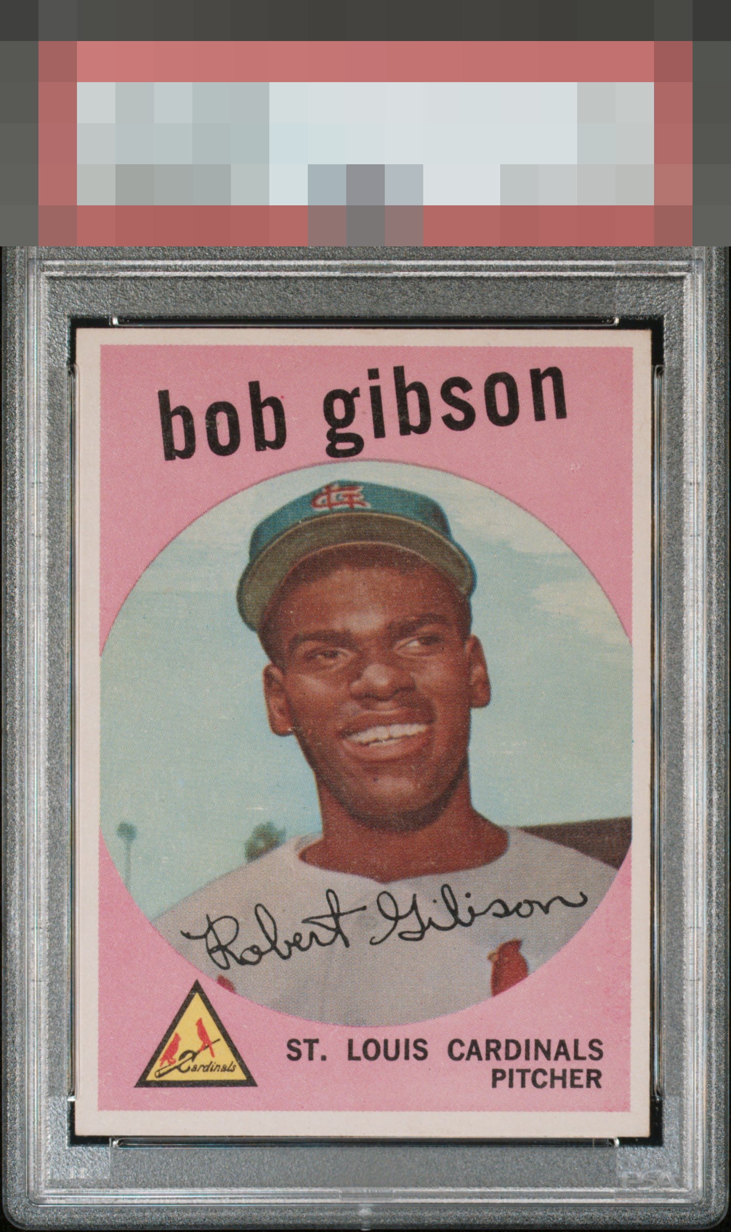
1959 Topps Bob Gibson #514

Reviews & Discussions
10 total reviews


nice looking card with the colors standing tall (muted but standing tall)

Decent looking card, there is some surface wear and the centering is a little off both ways.

Centering is really the only aspect of this Gibson that bumps my eye. Great focus and corners. Very good aesthetics overall.

The centering shift is first noted and there is some minor surface scuffing but the corners and eye appeal remains very good.

Very good eye appeal; focus and a clean pink background lead the way. Some noise in the image background and centering make impact. If the numerical system hit the back staining as hard as they usually do (the back does not faze me at all here), then they likely said 3-ish out of 10, which would be an F when I was in school. Yet to me the eye appeal is far stronger.
EyeQ+
EYEQ+ TROPHY CASE


Rating Distribution
10 total reviews
Centering both ways is the only issue to me and the rest is very strong. Overall the eye appeal his the 'very good' level.