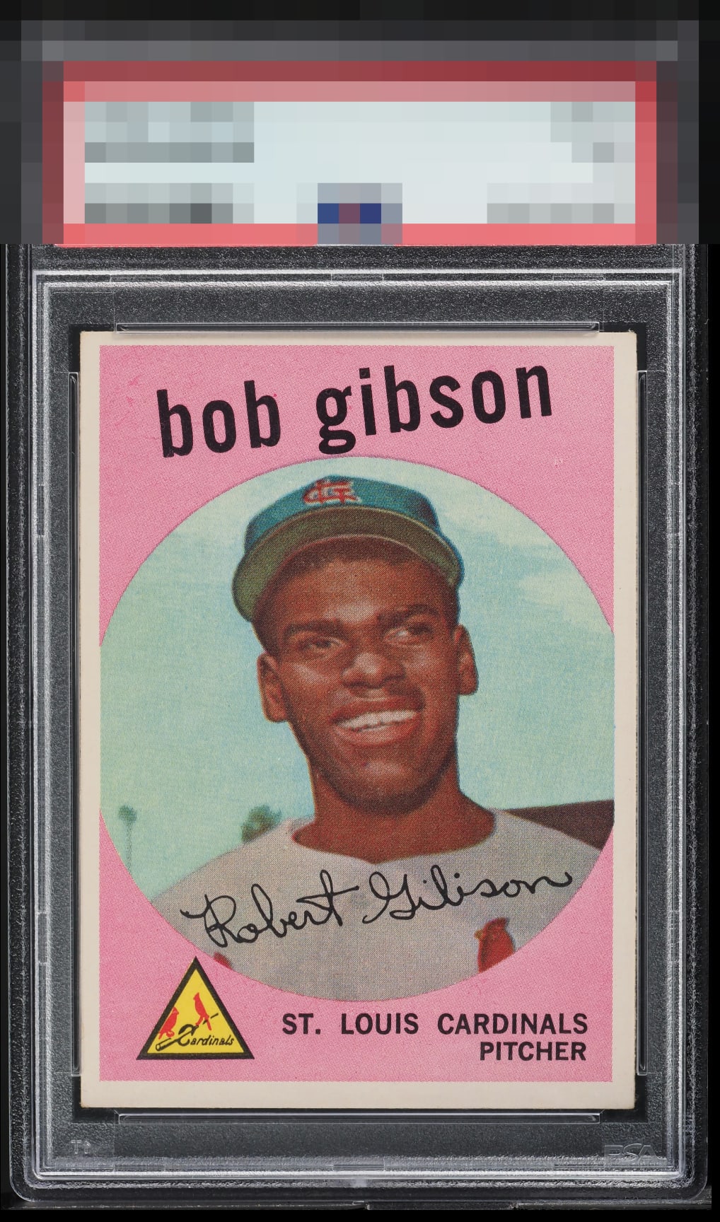
1959 Topps Bob Gibson #514

Reviews & Discussions
10 total reviews

Not bad yet the centering and some blemish left of the name distracts me.

Clean card, centering off top to bottom and the color is a little faded, doesn't really pop.

The first thing I notice is the light top border, but the color and image are quite nice overall.

Drop this centering down a little toward the bottom edge and this card cracks into the A tier of eye appeal for me.

Good colors and image. Some minor PD and surface blemishes in the pink. Centering is a bit off-centered. Nice solid example.

Good solid looking card. Image is strong and colors are good(minor discoloration on borders and centering opportunities top/bottom. This is a good card and would be a place holder for me.

Very pleasing and centering top to bottom is the only real eye appeal flaw.

Great color and image but centering could be better (especially up and down). I understand that this is a hard card to find centered but they are out there.
EyeQ+
EYEQ+ TROPHY CASE


Rating Distribution
10 total reviews
Centering keeps this from the A Tier.