1959 Topps Bob Gibson #514
Reviews & Discussions
12 total reviews


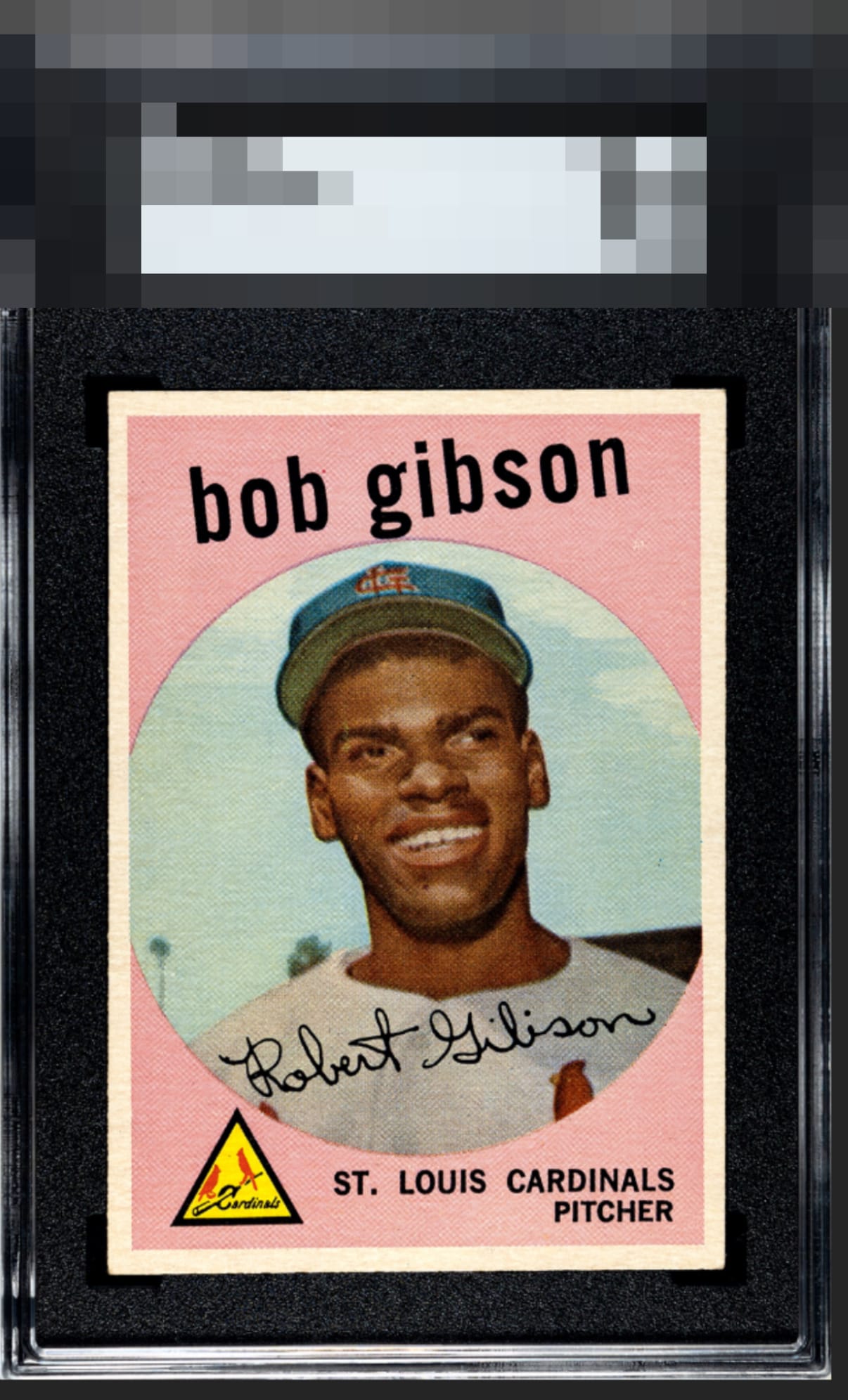
I'm normally one who goes into the A's only if the centering is really in the strike zone, yet making an exception here because I really love how the color and focus of his face please the eye. This card's overall eye appeal really pleases me more than any card centered like this that I have seen. Great color, great registration. Carries the day.

The 7 feels on the mark. The pink has lost noticeable saturation, which mutes the pop. Facial registration drifts slightly, softening detail. Left–right centering leans left but stays within a reasonable window, while top–bottom balance is solid. Overall, it presents as an honest seven or a B+ in my grade book.

Nice copy with all aspects being good, but not great. Think I’d be looking for a bit more pop in the pink

I'm a stickler for centering and tilt, but otherwise it's a great copy


Great centering for this card, scored a little lower based on the color and slight tilt


Love how bright and clean this card is. The colors and the image are sharp. Would grade higher if center although good was better
EyeQ+
EYEQ+ TROPHY CASE


Rating Distribution
12 total reviews
I like looking at this even with the centering being off.