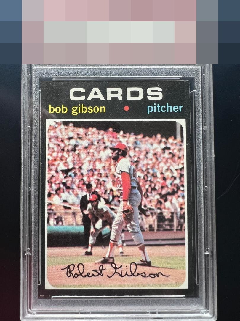
1971 Topps Bob Gibson #450
1 / 2
Click to enlarge

💬
Reviews & Discussions
7 total reviews

Very minor edge nicks don't bother my eye much. This is a strong 71 HOFer.

My exacting analysis notes near-perfect centering and highly sensitive black edges and corners that are largely undisturbed. Visual appeal of a high order is confirmed.


I dig this example a lot. The edges are smooth, corners not dinged, and you can breathe on these and they look bad. Centering is nearly dead on. Just a pretty example.

Some image blur but the centering and especially the edges please my eye a great deal. 71 is a set where my eye sweeps the edges even before checking centering.

lots of surface wear effecting the image and color quality but it has a nice image(bit blurred for my liking) and has good centering
Locked

0 reviews
EyeQ+
109.0
Global Population
1
POPULATION ACROSS ALL GRADES AND GRADING COMPANIES
Global Eye Rank
#1
Population in Grade
1
POPULATION IN THIS GRADE ACROSS ALL GRADING COMPANIES
Eye Rank in Grade
#1
EYEQ+ TROPHY CASE

1st Place
GLOBAL

1st Place
IN-GRADE
📊
Rating Distribution
7 total reviews
G
0%
A+
0%
A
3 ratings
43%
3
A-
3 ratings
43%
3
B+
0%
B
1 rating
14%
1
B-
0%
C+
0%
C
0%
C-
0%
D+
0%
D
0%
D-
0%
F
0%
Nicely centered and the corners and edges look great for a 71. Some snow or surface wear in the black background holds this back a little.