1959 Topps Bob Clemente #478
1 / 2
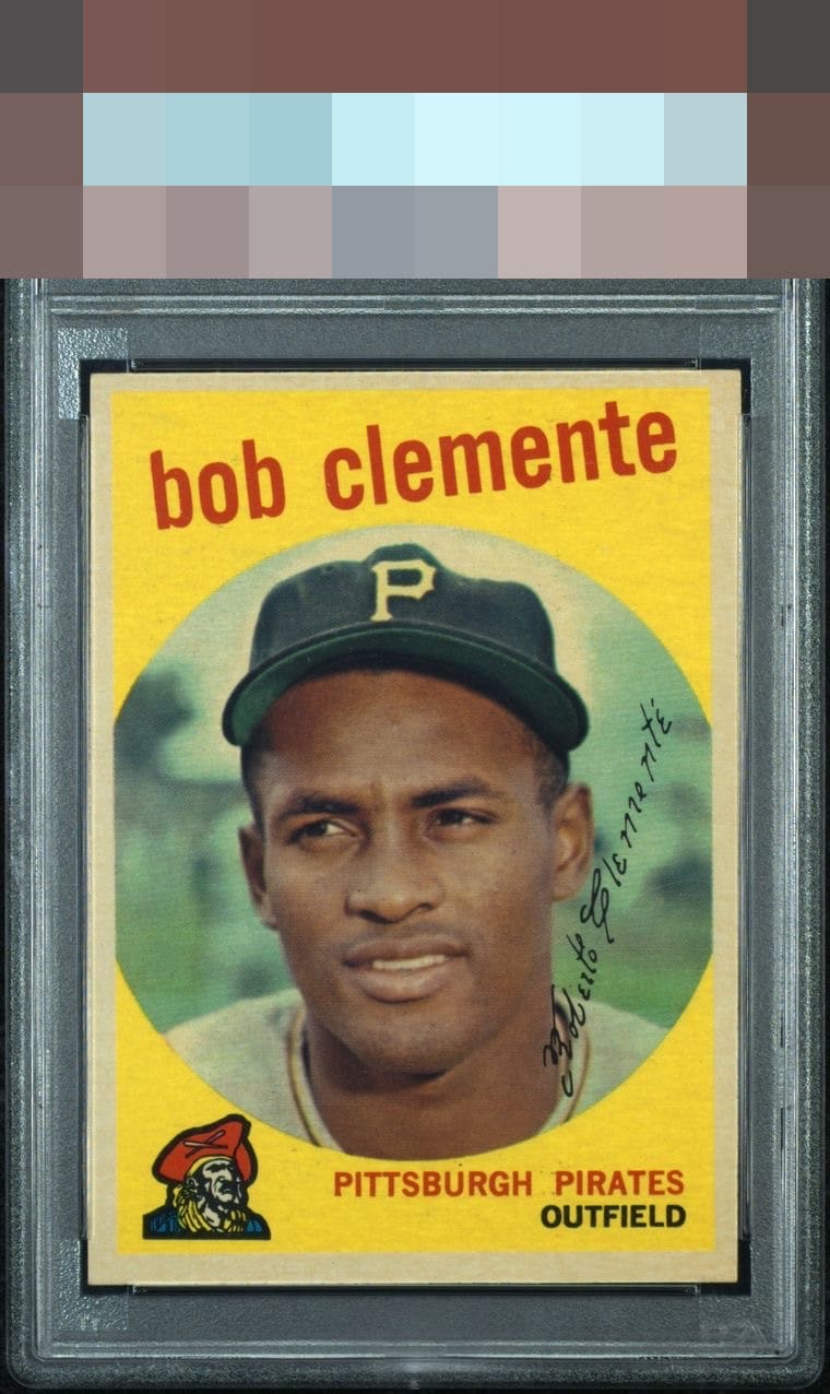
Click to enlarge
💬
Reviews & Discussions
5 total reviews


A lot of toning, left-right tilt, top-bottom centering. Very clean image and no noticeable PDs. Solid card.


5 of 7 reviews

0 reviews
EyeQ+
--
Global Population
3
POPULATION ACROSS ALL GRADES AND GRADING COMPANIES
Global Eye Rank
—
No Eye Q+ score
Population in Grade
1
POPULATION IN THIS GRADE AND GRADING COMPANY
Eye Rank in Grade
—
No Eye Q+ score
EYEQ+ TROPHY CASE

GLOBAL

IN-GRADE
Trophies appear here when earned.
📊
Rating Distribution
5 total reviews
G
0%
A+
0%
A
0%
A-
0%
B+
3 ratings
60%
3
B
2 ratings
40%
2
B-
0%
C+
0%
C
0%
C-
0%
D+
0%
D
0%
D-
0%
F
0%
Distraction-free yellow is key for me, and a clean image as well. Centering and border toning, which shows up against the yellow design, make some impact. Very good overall.