1959 Topps Bob Clemente #478

Reviews & Discussions
10 total reviews

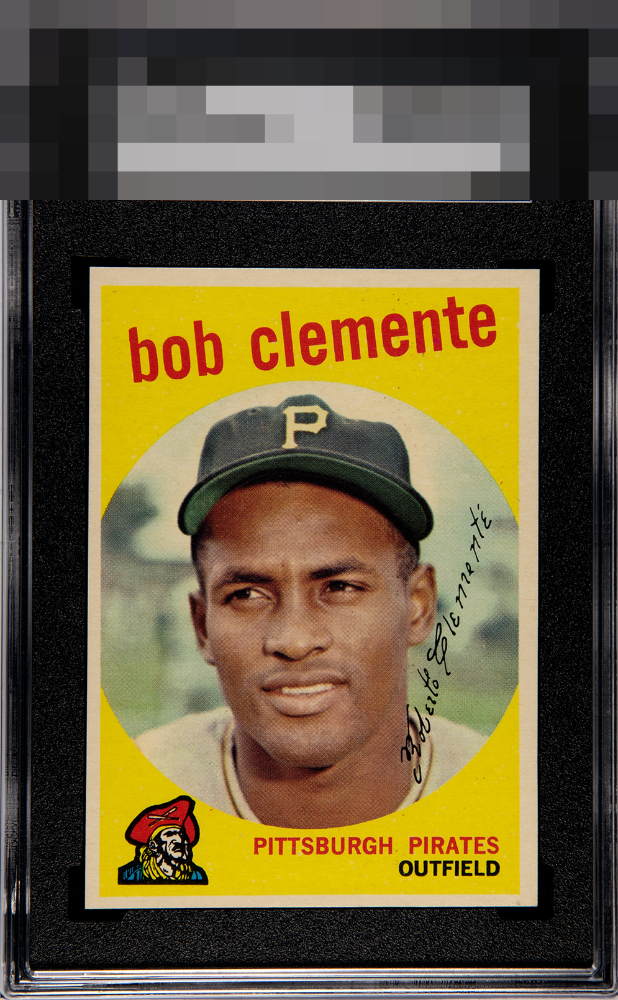
Image clarity and the absence of much PD allow the eye appeal to achieve highest-tier status. Centering and very mild stray ink in the upper region of the card are logged with weight. A pleasing copy to my cycloptic eye.

Rich color, strong yellow saturation, a consistent surface, and sharp registration. The vibrant yellow background creates exceptional visual presence, and the clean print quality allows the portrait to show clarity and energy. Centering falls short of ideal and remains the primary factor holding the example back from an even stronger overall presentation for me. Yet the yellow background masks the centering impact a bit on this one. It remains easy to engage with Clemente without distraction. Very satisfying.


Very clean but the centering is off left to right and there are some minor print defects.

High eye appeal here with side centering the main dampener and mild PD the secondary issue.

Strong eye appeal. Centering and some black PD are the only flaws that I notice but they do not spoil the affair.

The colors and image are nice and really like the look of the Yellow. The centering bothers me alot and the mis-sizing of them bothers me also.

Some PD in the yellow. Centered a bit to the left. Card presents very well with a nice image and bright yellow background.

EyeQ+
EYEQ+ TROPHY CASE


Rating Distribution
10 total reviews
Off-centered, strong colors.