1966 Topps Bob Clemente #300
1 / 2
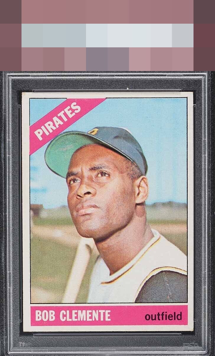
Click to enlarge
💬
Reviews & Discussions
7 total reviews


Shift is quickly noticed but corners and image is nice. Nice eye appeal.

Centering I notice, but the corners I really don't find troubling. Overall strong eye appeal on this card.

like the look and like the colors and contrast but nothing catches my eye for the Wow factor


Minor centering shift and corners make modest impact to eye appeal for my taste. Nice card!
Locked

0 reviews
EyeQ+
118.0
Global Population
1
POPULATION ACROSS ALL GRADES AND GRADING COMPANIES
Global Eye Rank
#1
Population in Grade
1
POPULATION IN THIS GRADE ACROSS ALL GRADING COMPANIES
Eye Rank in Grade
#1
EYEQ+ TROPHY CASE

1st Place
GLOBAL

1st Place
IN-GRADE
📊
Rating Distribution
7 total reviews
G
0%
A+
0%
A
0%
A-
3 ratings
43%
3
B+
3 ratings
43%
3
B
1 rating
14%
1
B-
0%
C+
0%
C
0%
C-
0%
D+
0%
D
0%
D-
0%
F
0%
This one is close for me. Centering shift takes it downa notch, but otherwise beautiful copy