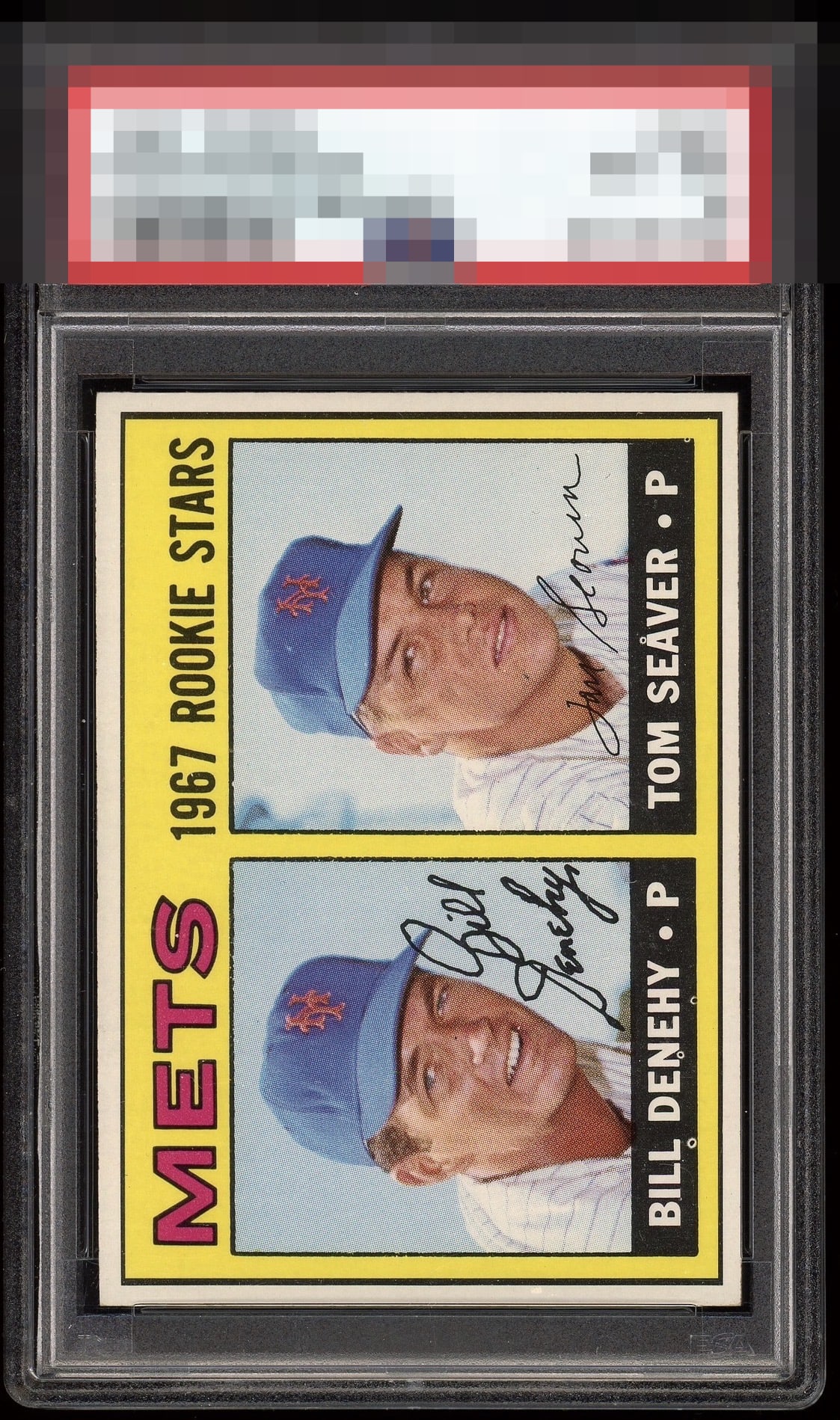
1967 Topps Bill Denehy & Tom Seaver #581
1 / 2
Click to enlarge

💬
Reviews & Discussions
7 total reviews


Without the fisheyes this soars into the top tier and highly so, yet the eye appeal is still high thanks to great centering.

Side centering is top priority for me on a horizontal and that aspect here is GT. Top to bottom centering remains in the A Tier. Those pesky white print dots are the flaw that impacts eye appeal on this specimen.


The dark spot on Seaver's chin draws my eye. Multiple fisheyes down in the name box is distracting. Colors and and image look good.
Locked

0 reviews
EyeQ+
102.0
Global Population
1
POPULATION ACROSS ALL GRADES AND GRADING COMPANIES
Global Eye Rank
#1
Population in Grade
1
POPULATION IN THIS GRADE ACROSS ALL GRADING COMPANIES
Eye Rank in Grade
#1
EYEQ+ TROPHY CASE

1st Place
GLOBAL

1st Place
IN-GRADE
📊
Rating Distribution
7 total reviews
G
0%
A+
0%
A
2 ratings
29%
2
A-
1 rating
14%
1
B+
3 ratings
43%
3
B
1 rating
14%
1
B-
0%
C+
0%
C
0%
C-
0%
D+
0%
D
0%
D-
0%
F
0%
Above average copy, but the centering isn't quite there and it has a slight diamond cut. Nice corners though.