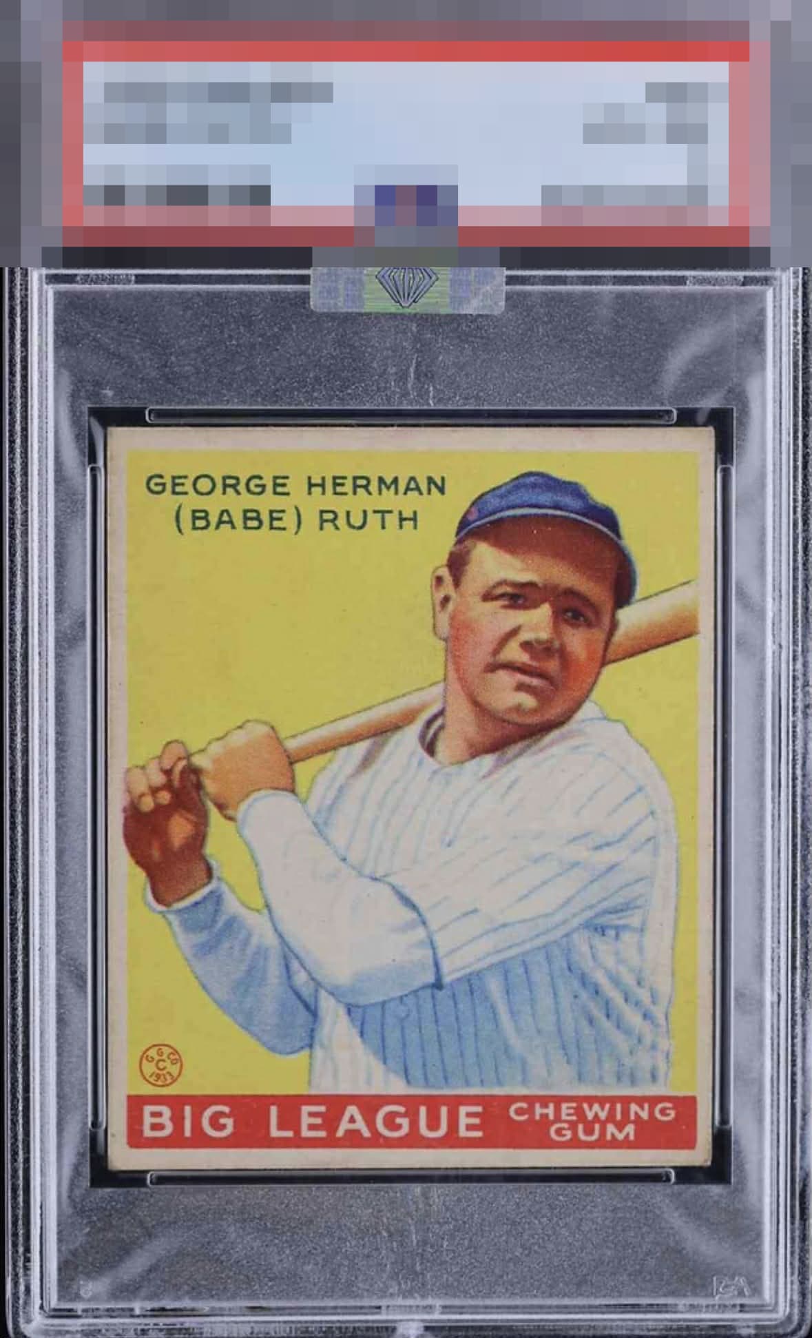
1933 Goudey Babe Ruth #53
Reviews & Discussions
9 total reviews

Such a banger. Little tilt and the slightest corner touches at the bottom are the only (dumb) comments keeping this guy out of GT.

Tilt from God Tier and the corners are seen but shrugged off. Beautiful.

Very little to pick at on this one. Some corners if those are your thing but overall just a WOW card.

Very nice looking card. The image and color look great. Centering is better than most, but a little off with a slight tilt. Minor surface wear is the only other issue.

great looking card. The Yellow Really pops and that image is strong and coming off the card. THe centering is ok and the border size is the opportunity but this card has the WOW facotr

Very nice centering with a subtle tilt. A touch of wear but minor. Love the colors and image.


Showstopper. One of the best examples I have seen of one of my favorite baseball cards. The registration, the yellow, the centering, even the corners are solid. Mild tilt is the only flaw worth citing to my eye.

EyeQ+
EYEQ+ TROPHY CASE


Rating Distribution
9 total reviews
One of the most revered cards in collecting, this example proudly and firmly stands in the Top Tier of Eye Appeal. Its strengths include a clean, bright yellow background, a focused image of Ruth, and attractive centering. Minor flaws that I detect and consider are a slant or tilt to the red, "Big League Chewing Gum" rectangle relative to the bottom border and corner wear. Some may also notice faint surface dirt in the left side of the card. Of course, this being Eye Appeal Inc, the question is not, "Do flaws exist?" But rather, "Do they affect aesthetic presentation?" The answer to the latter is a resounding, "Not much."